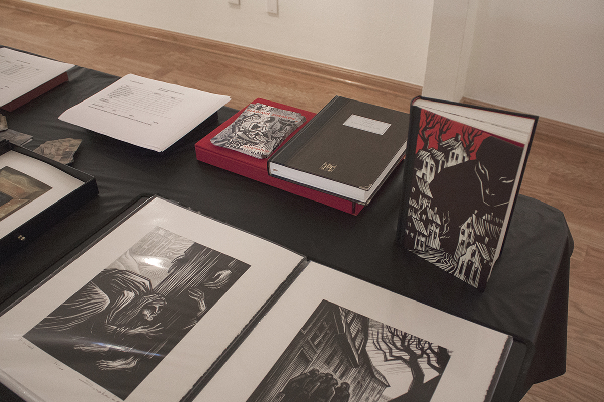
Some time ago, my mentor Mihail Chemiakin presented me with a book – a collection of short stories by Alexandr Chayanov. Chemiakin suggested that I should have a go at illustrating some of the writing.
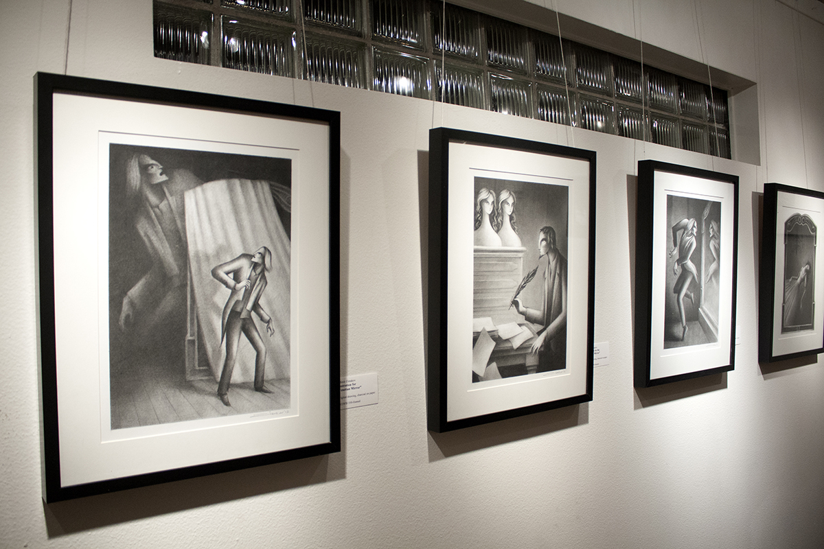
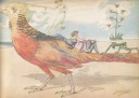
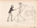
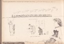
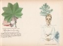
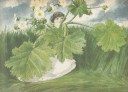
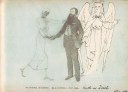
As I started reading, the stories blew me away by their dark and whimsical narratives, the nature of the characters, the picturesque descriptions of early 20th century Moscow, its surroundings… A man falls in love with a doll depicting two conjoined twins and sets on a journey through Europe to find them, another man buys a mirror in an old Venetian shop and becomes a prisoner of his own reflection. Some of the other characters include ghosts, mermaids, circus performers and mannequins. The narratives are filled with mysticism and grotesque.

The stories were first published in the 1920’s in Russia and became quite a sensation. In her memoir, Mikhail Bulgakov’s wife, Elena Belazerskaya mentions that Chayanov’s stories had a huge influence on Bulgakhov and eventually influenced his masterpiece “Master and Margarita”.
However Chayanov never became a household name. His books were never translated into any other language. Chayanov’s fate is as mysterious as his stories. His main profession was an agrarian economist, he was a scholar of rural sociology and an advocate of agrarianism and cooperatives. In 1930 he was arrested by the Soviet officials and his books became banned. In 1937 he was arrested again, tried and shot to death on the same day. His writing did not resurface until the late 80’s, and even then they were published abroad.

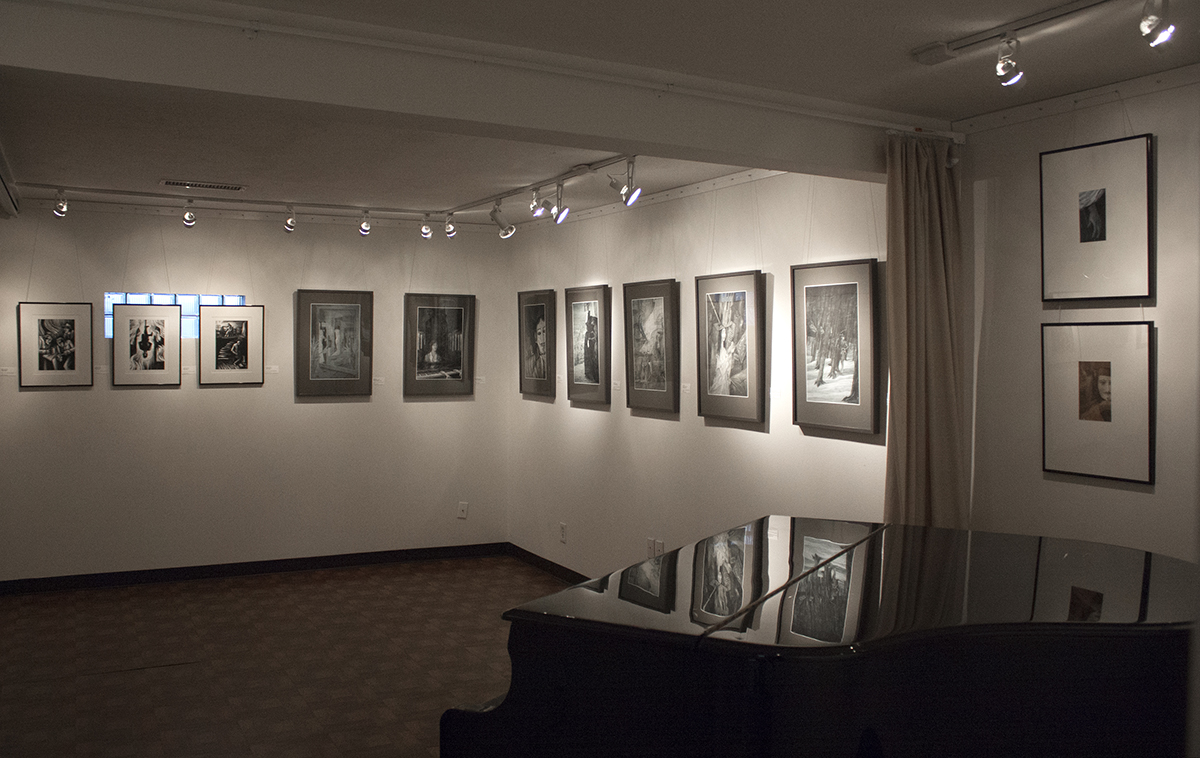
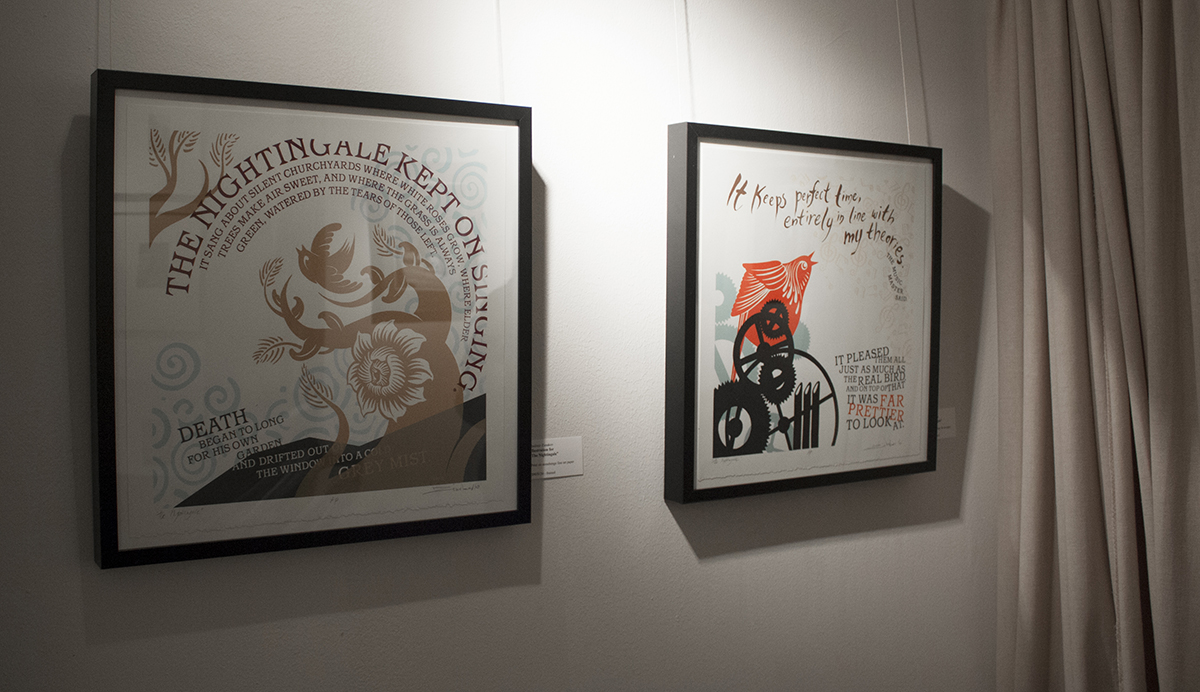
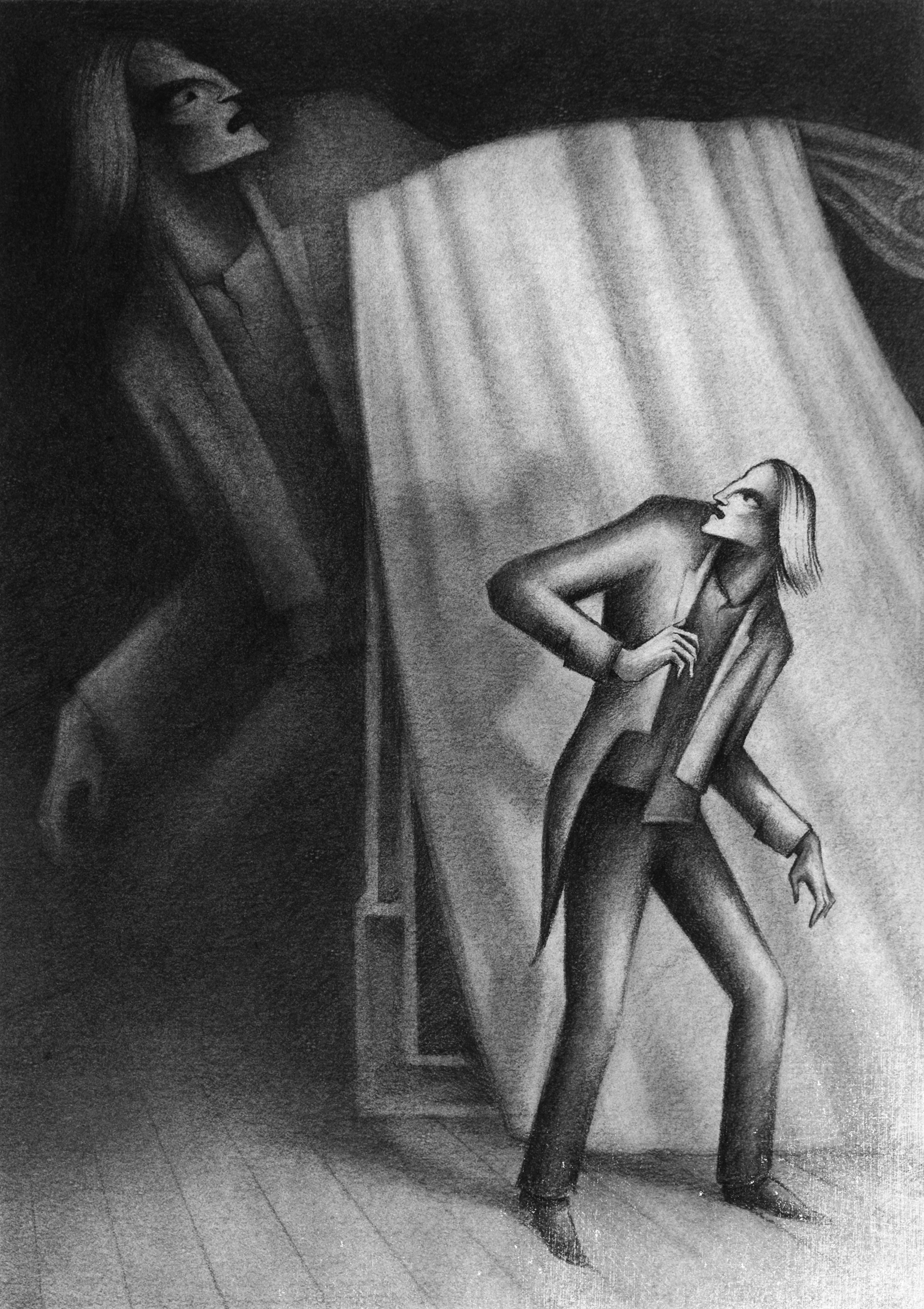
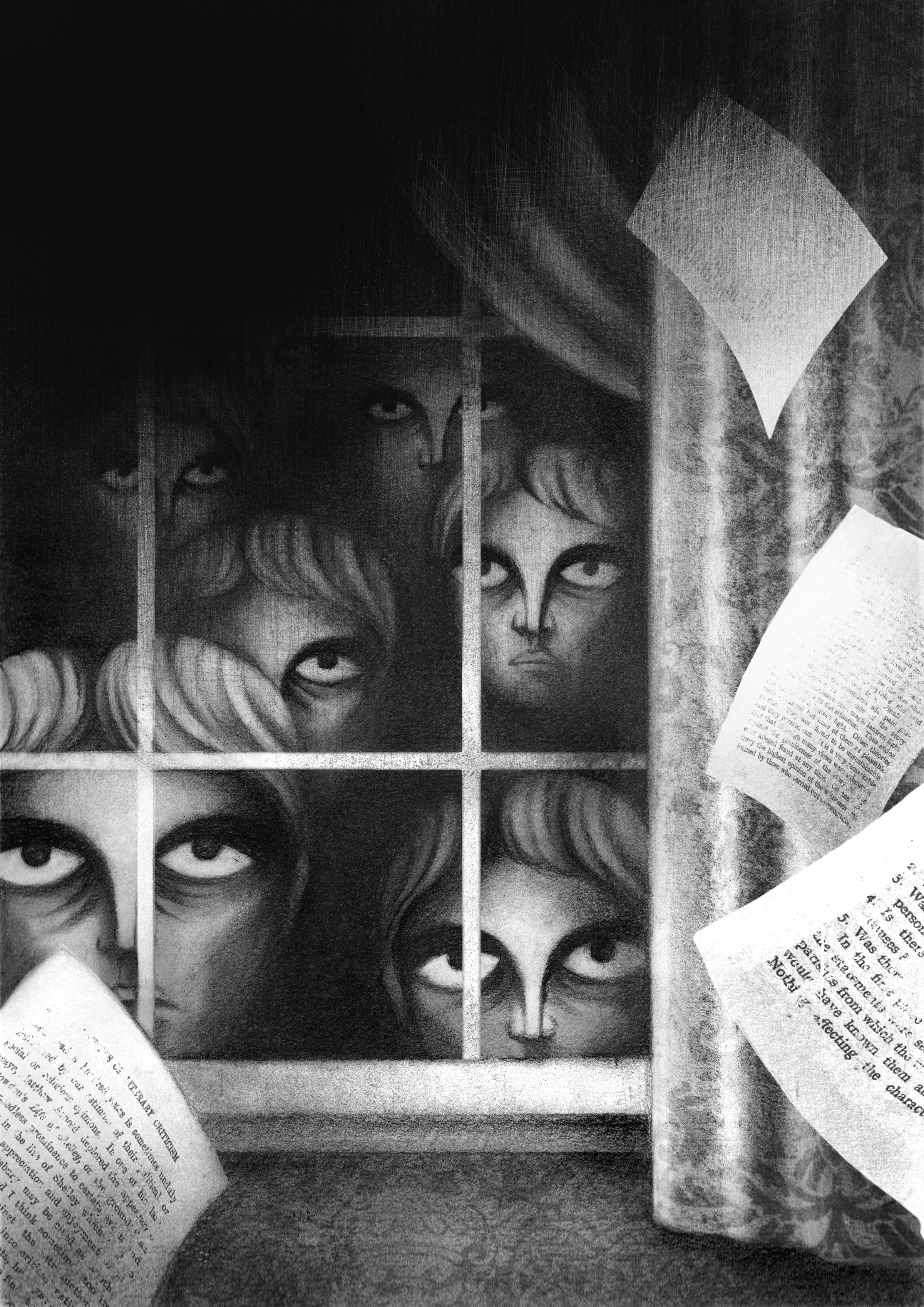
Creating visuals for those superb stories created a true challenge. I knew that I didn’t want to use the linocut technique that I’ve used illustrating Meyrink, Gogol and Poe. There was a softer tone; dark, melancholic and at the same time whimsical and sometimes even humorous. There were some hints of Art Nouveau, something from the Impessionists with a bit of Goya and Jacques Callot.

Leaving the carving tools behind and getting out of my comfort zone, I’ve started doing charcoal drawings, constantly looking at a lot of turn of the 20th century photography. The atmosphere in those photos helped me understand Chayanov’s environment.

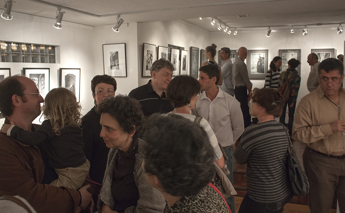
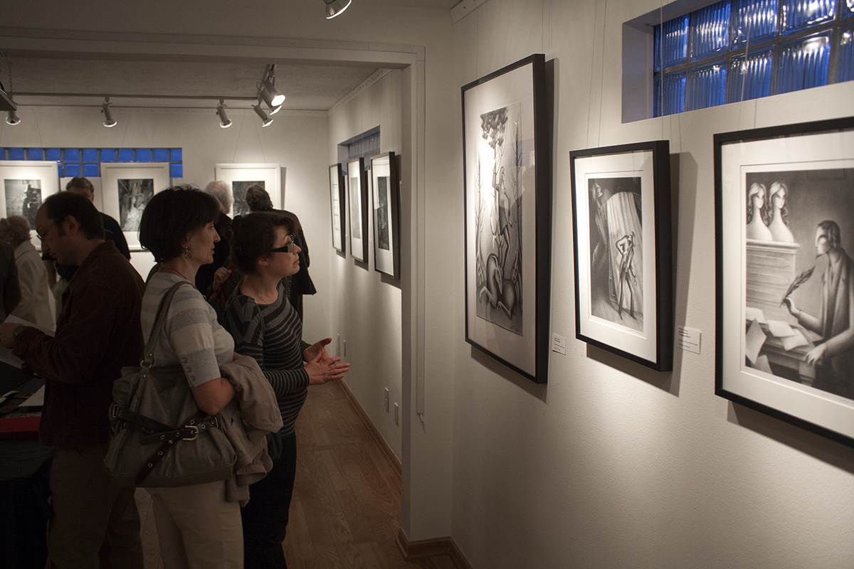
At this point I’ve done 6 illustrations that were drawn, collaged and then digitally manipulated. Still a work in progress with many more to come. Stay tuned!