After the draft is complete (see Sketch to Lino Process, part 1). The design needs to be printed out on a laser printer. You will also need CitrSolve solution, a foam brush, bone folder, masking tape, lino block and some paper towels. This is the method I use to transfer the image onto a linoplate:
Sketch to Lino Process, part 1
Working out all the details of the composition at the draft stage is quite crucial before moving on to carving the lino. In this part, I will walk you through my approach and in the second part show how I transfer the refined draft on to a lino block.
Some artists prefer more of an expressive approach and can start carving based on a very rough sketch. Some prefer to draw directly on a lino block. I found that resolving all the details of the composition beforehand on paper is quite helpful and will illuminate any miss steps down the road. I prefer to develop the draft in pencil or on a tablet so that it looks very close to the final linocut. There will still be quite a lot of things to improvise on once you start carving, since carving is very different from drawing.
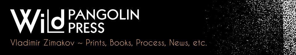
Here is an example of a flower sketch that I’d like to turn into a linocut, including some initial reference photos.
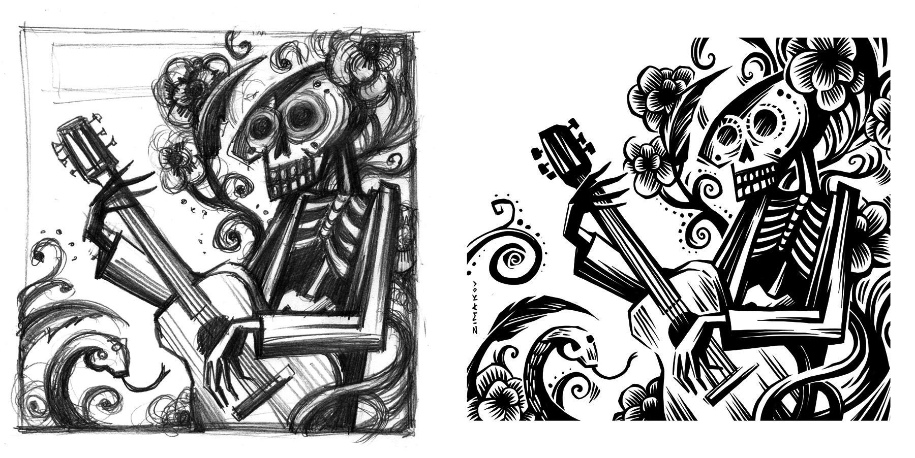
This is just an idea and it doesn’t really give me much clues on how to approach the shading or the cross hatched parts, along with other elements of design. Remember that you can’t really create “greys” in a one color linocut, but you can create an illusion of greys and halftones. Relief printmaking has its own visual vocabulary which is different from drawing or painting. At this point it’s very helpful to do your research and get clues from how other printmakers were able to achieve the results that you are going for. When studying the reference images, it’s important not just to copy the technique, but see what additions you can make to create a more unique, personal look.
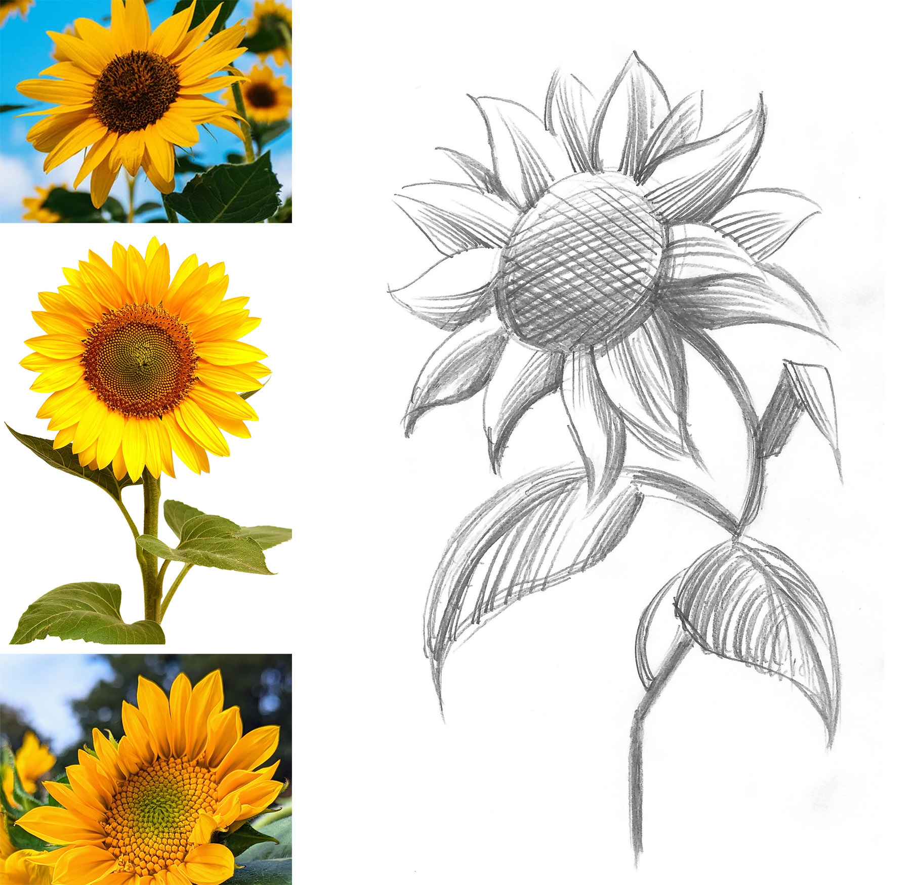
Here are just a few examples of classical plant prints (top left – a print by Julie deGraag, 1919; bottom left and right – artist unknown).
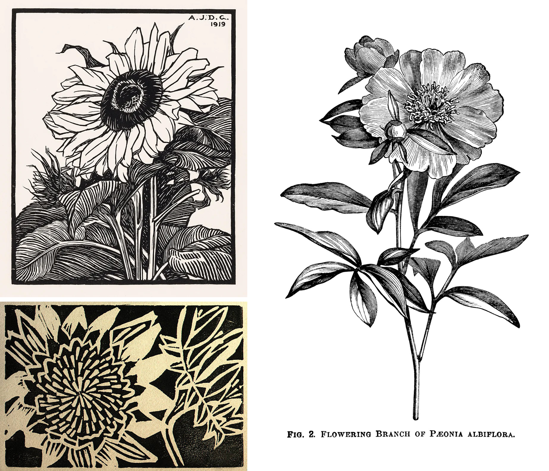
I lay the sketch under the marker paper and start to work out the details. You can see through the marker paper, so that’s really helpful, but it’s not as transparent as tracing paper. So, you can work on a new interpretation while still seeing the original sketch. You can also use regular print paper and a lightbox for this step.
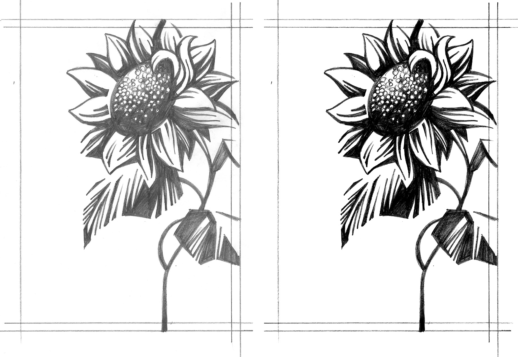
Sometimes I rework the draft several times until everything is how I would like it to be. At this stage I am trying to eliminate the grey tones and just focus on solid black lines and shapes. After the final draft is complete (left image), I scan it and increase the contrast in Photoshop (right image). When the image will be transferred onto a lino block from a printout using CitraSolve solution, it’s important to eliminate all the greys, since they will not transfer – more on this in the next part.
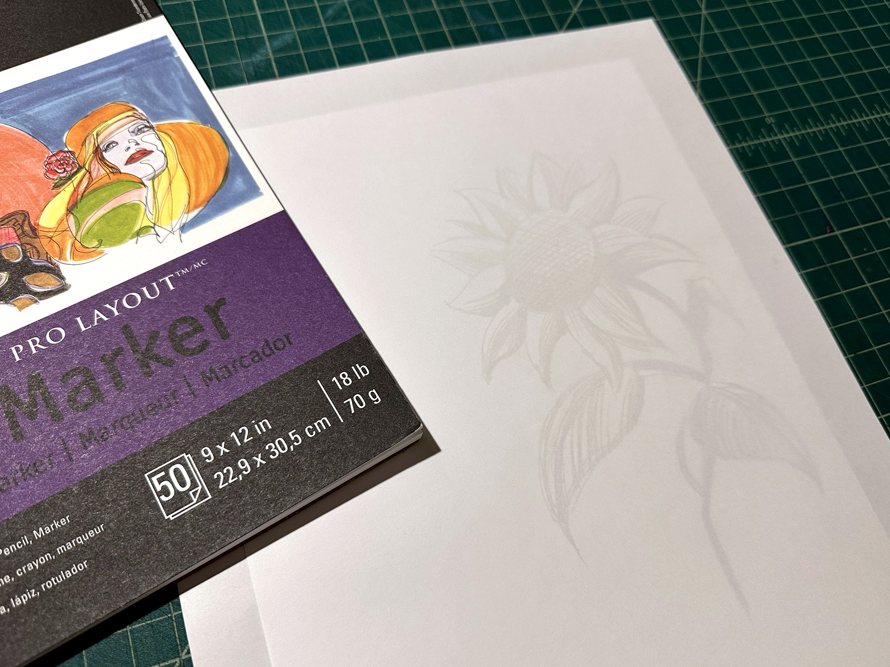
Once I have a solid black and white image, I am ready to transfer it to a plate.
When working on the multi-color print, I still like to start with the solid framework (one plate). Once that’s resolved, I will start to add additional layers that I want to be in color. This can be done on a marker paper or directly in Photoshop. Lately, I have been going over the final pencil drafts on a drawing monitor or iPad pro. It’s easy to create layers and try out different approaches. Below is an example of a sketch and refined draft created in Photoshop using an XP-Pen drawing tablet.
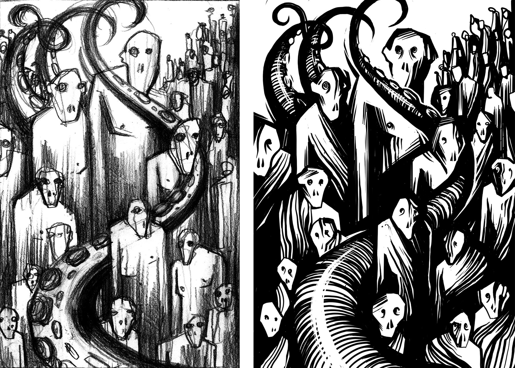
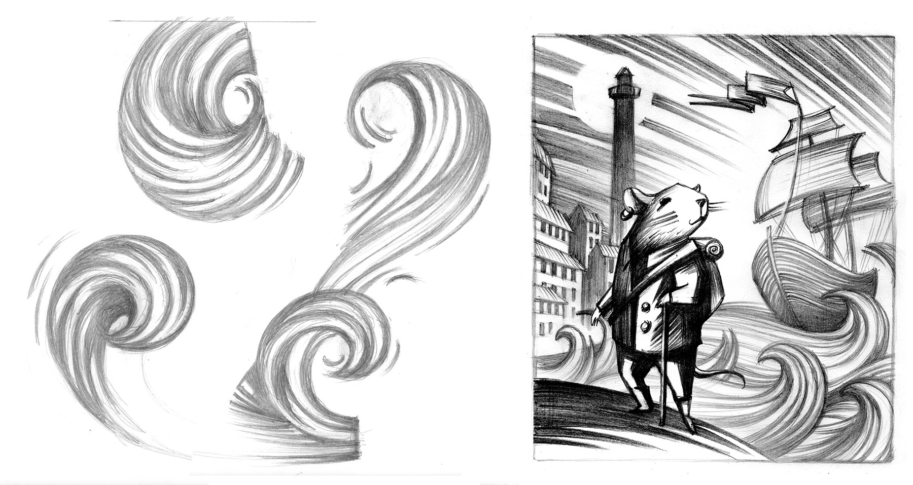
It’s important not to rush things. I usually let the printout of the draft hang in my studio for a few days. Oftentimes, I would make adjustments or add additional elements, while thinking about the final print and the limitations that I might encounter when carving. In the examples below I kept the composition the same, but tried out different textures on the characters to see what will give me the most dynamic composition. The version on the left was used for the final print.
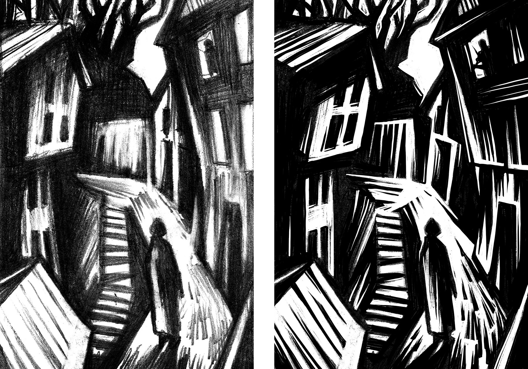
Here are a few more examples of initial sketches and the final draft ready for transferring to a linoplate.
TIP: When working out an element that you haven’t done before in a print, it’s always good to practice various approaches to creating that element. Those are different interpretations of waves and how I applied them in a final composition.
Random Turns Exhibition at TurnPark Art Space
My solo exhibition Random Turns is now on view at the beautiful TurnPark Art Space, located in West Stockbridge, MA. The exhibition features new drawings, structures and prints that were created this year. The work will be on display through October 31st, with the opening reception and artist talk taking place on Saturday, September 16, 4 to 6 pm. This will be followed by an afterparty and live music in the park.
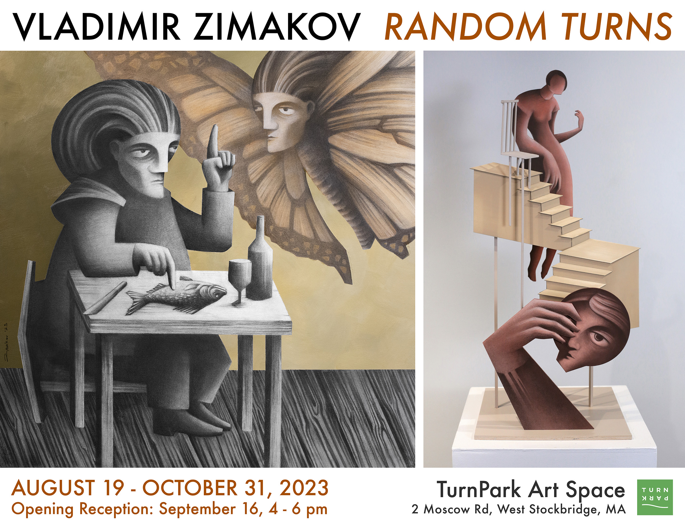
From the Artist’s Statement: Vladimir’s work captures imaginary moments and narratives based on emotions, intuition and irrationality. Concepts such as inspiration, obsession, temptation, irony and madness are transformed into concrete and vivid images, where various characters are assembled to interact with each other and their environment. Common occurrences are juxtaposed with absurd and nonsensical situations. The artist attempts to make sense of our own actions and interactions through visual metaphors and humor, often going beyond logic and reason.
The drawings and structures presented at Random Turns originated from sketches, drafts and studio experiments created over the past few years. Some of Vladmir’s works are further explorations of the ideas that took root in his book illustration projects; other times, the compositions were inspired by random occurrences that happened throughout the day. Many of the artworks were created with much consideration for the environment in and around Turn Park Art Space.
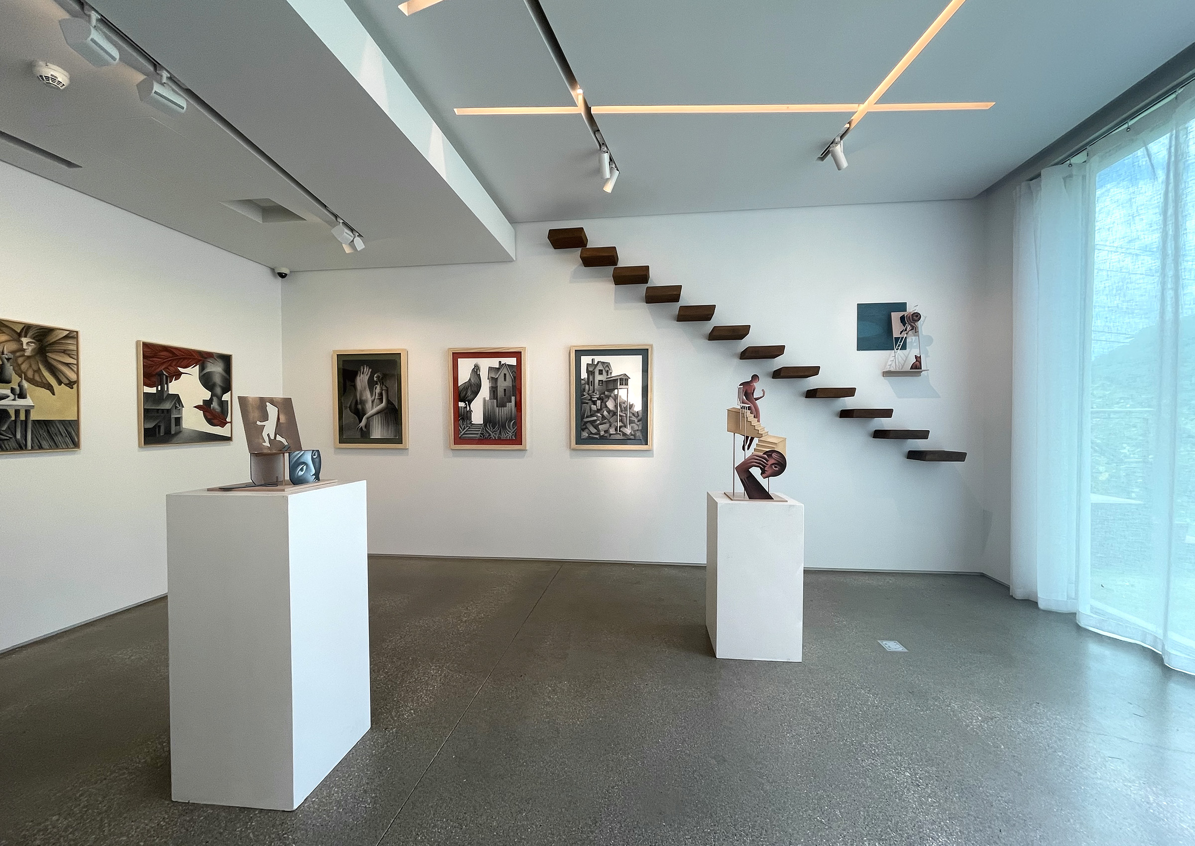
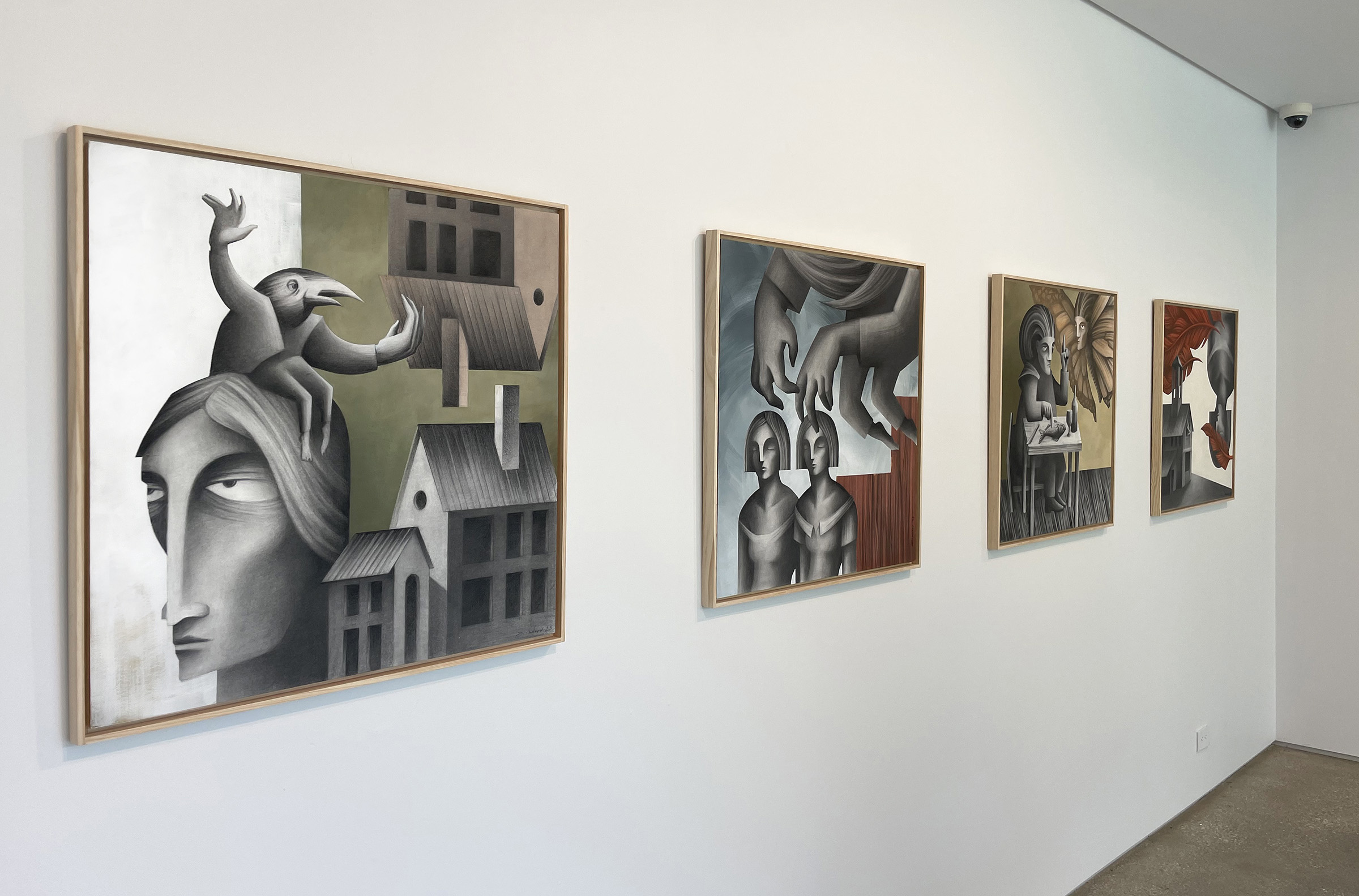
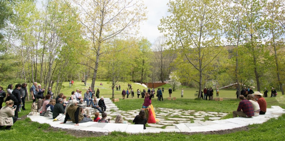
TurnPark is a contemporary art space, situated on 16-acres of a former quarry in the Berkshires. There are hills, meadows, a lake, and a 65-foot vertical drop offering breath-taking views of the surrounding landscape. It is home to a unique collection of outdoor sculptures, as well as ongoing art exhibitions and temporary installations. Located just 40 minutes away from MASS MoCA and other cultural landmarks.
If you are in the area, I hope that you can stop by and check out this truly unique and beautiful space. More information about the exhibition and the park can be found here.
In other developments, I am getting ready to embark on a new book illustration project that will keep me busy through the fall and plan to participate in the Oxford Book Fair in England in December, where Haddocks’ Eyes will make its European debut.
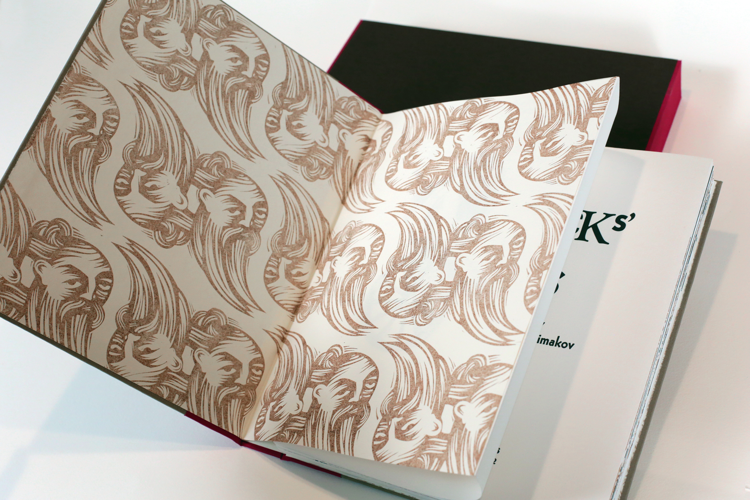
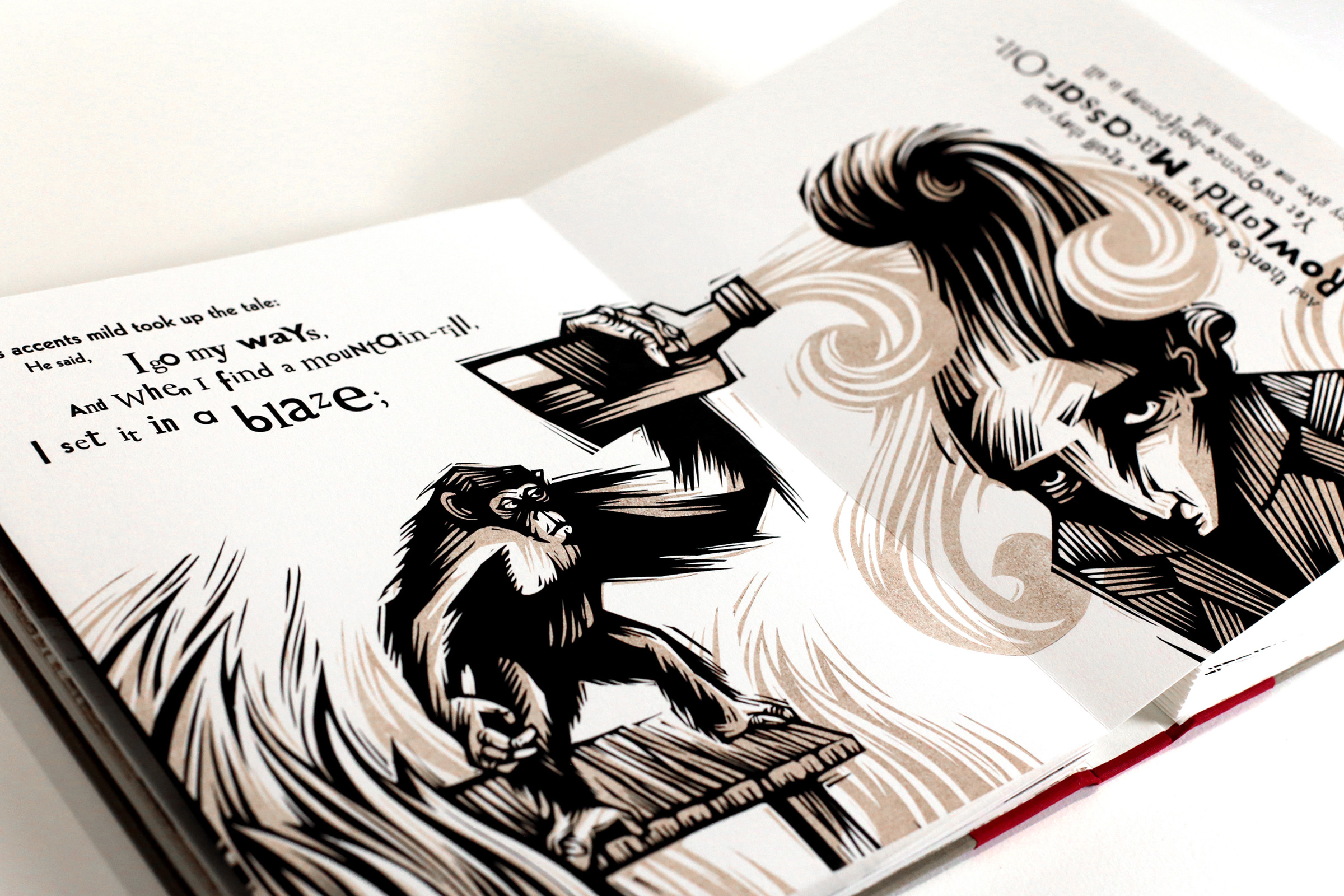
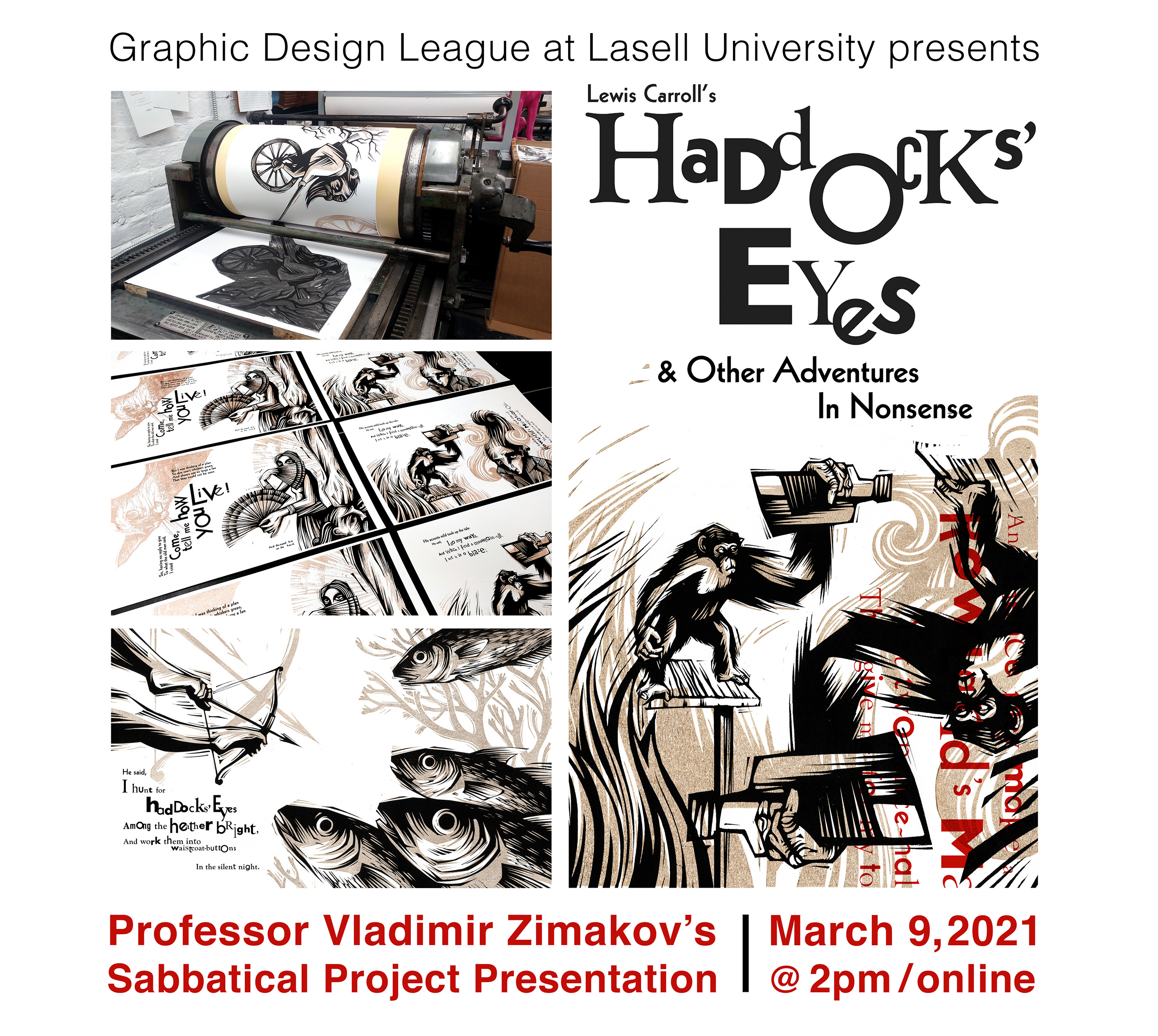
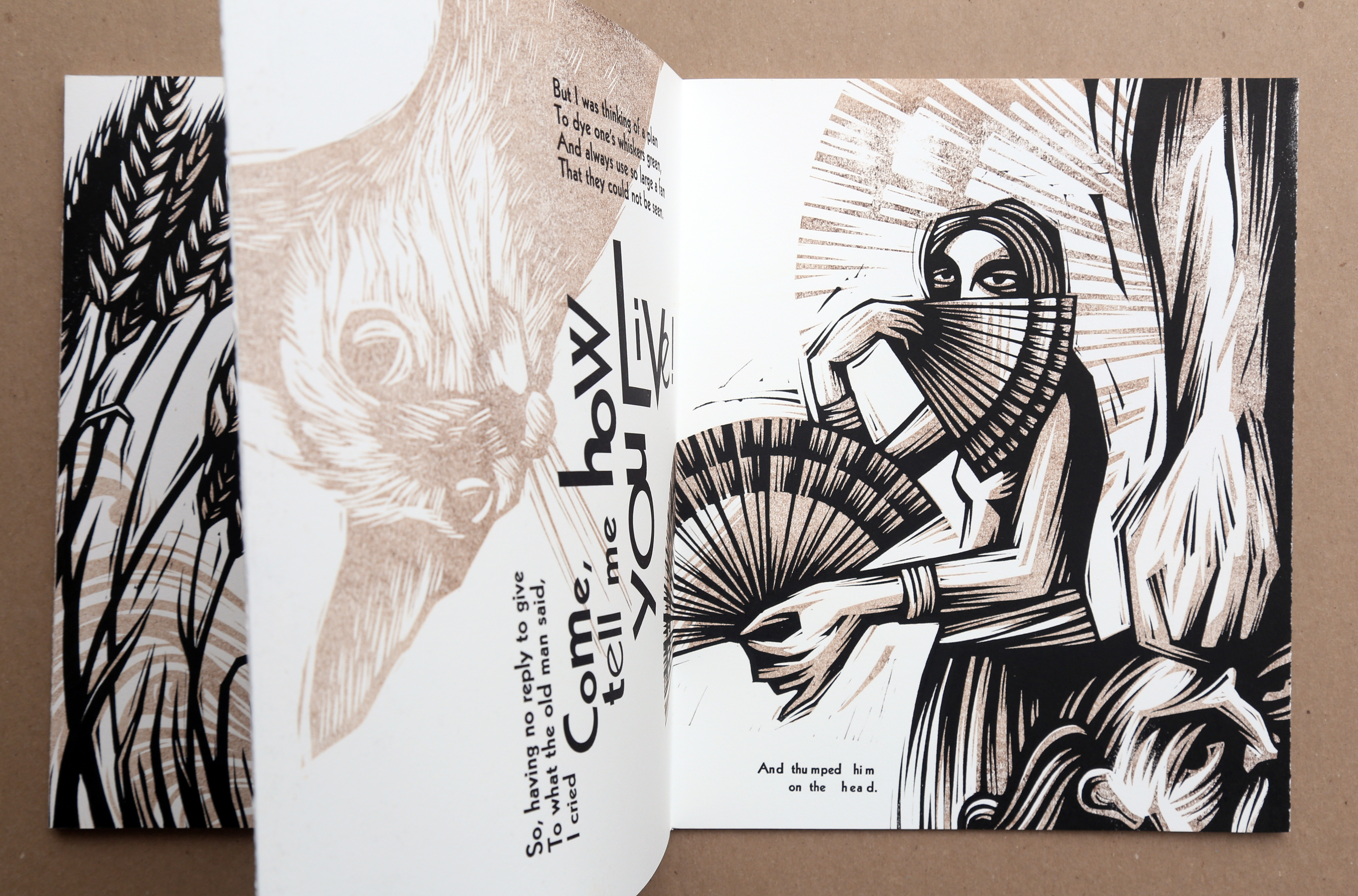
Haddocks’ Eyes Limited Edition Book Now Available!

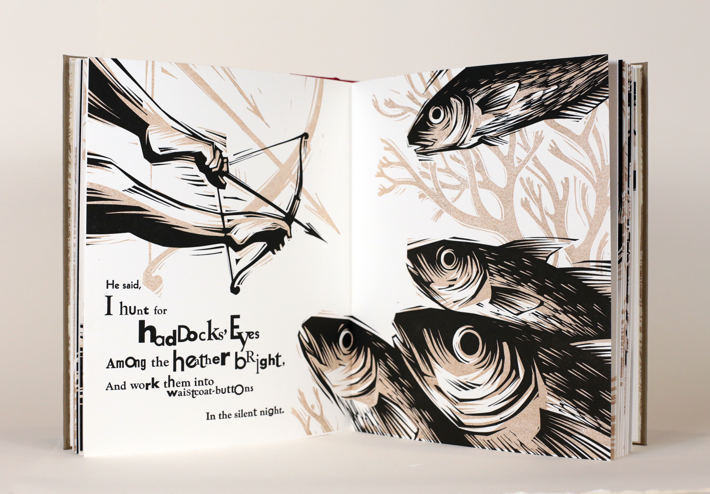
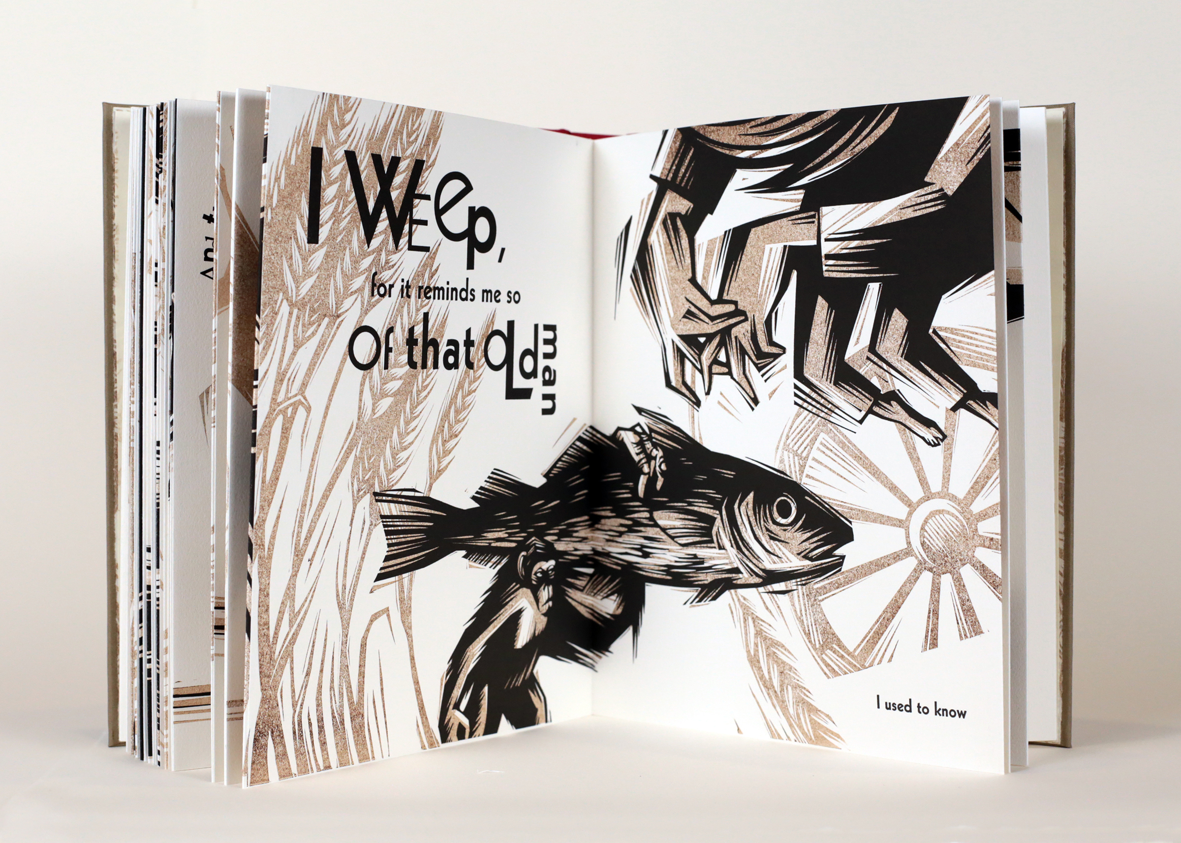
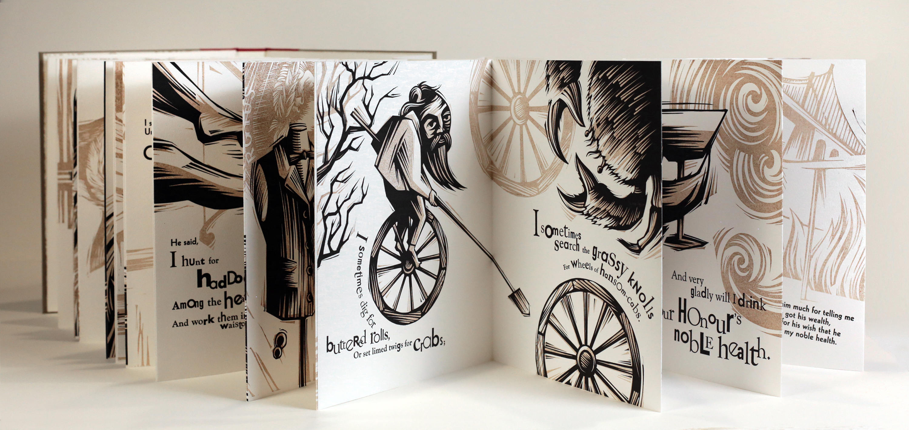
My latest publication, a limited edition book – Haddock’s Eyes, based on Lewis Carroll’s poem from Through the Looking Glass is now available to order.
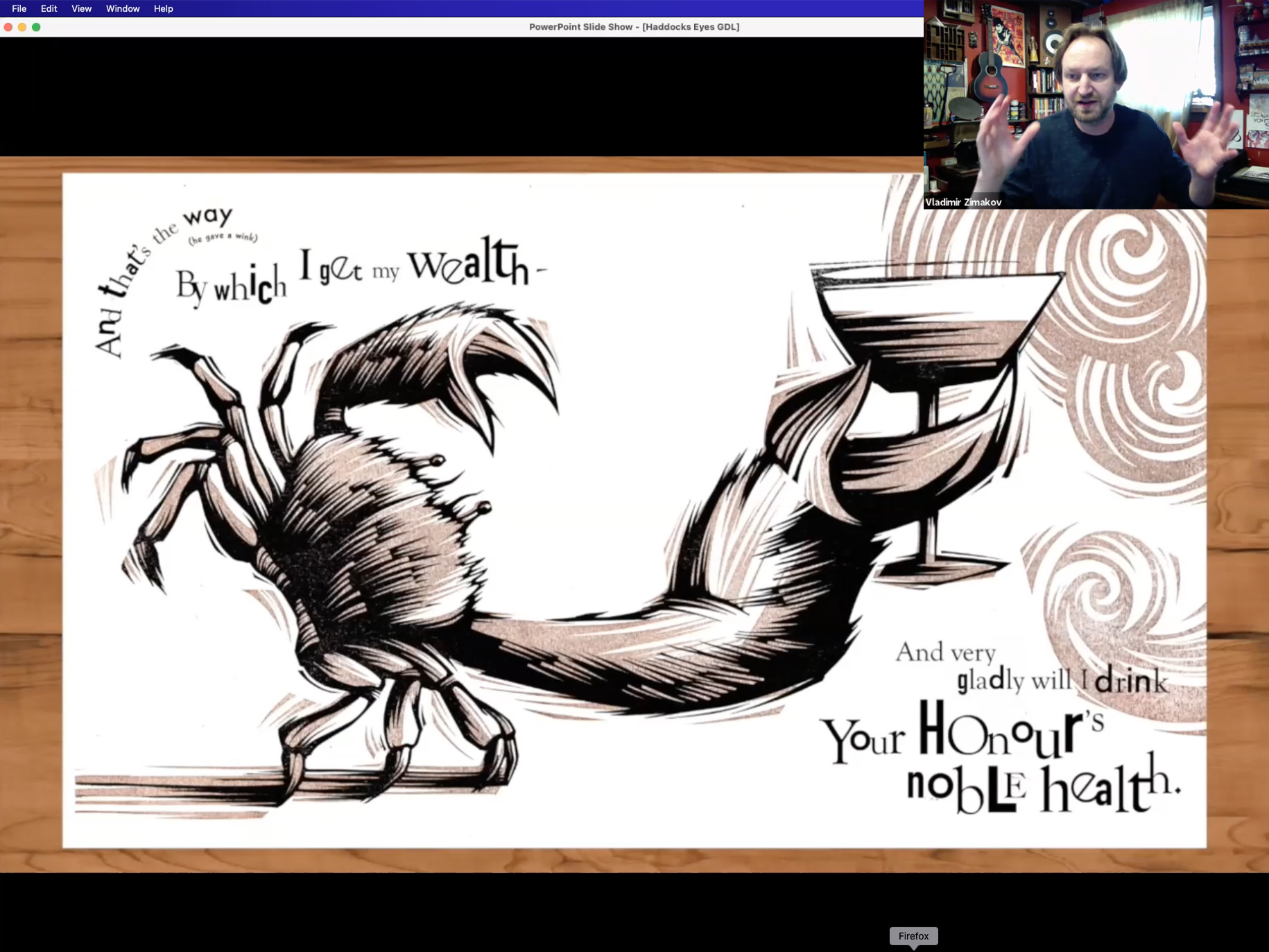
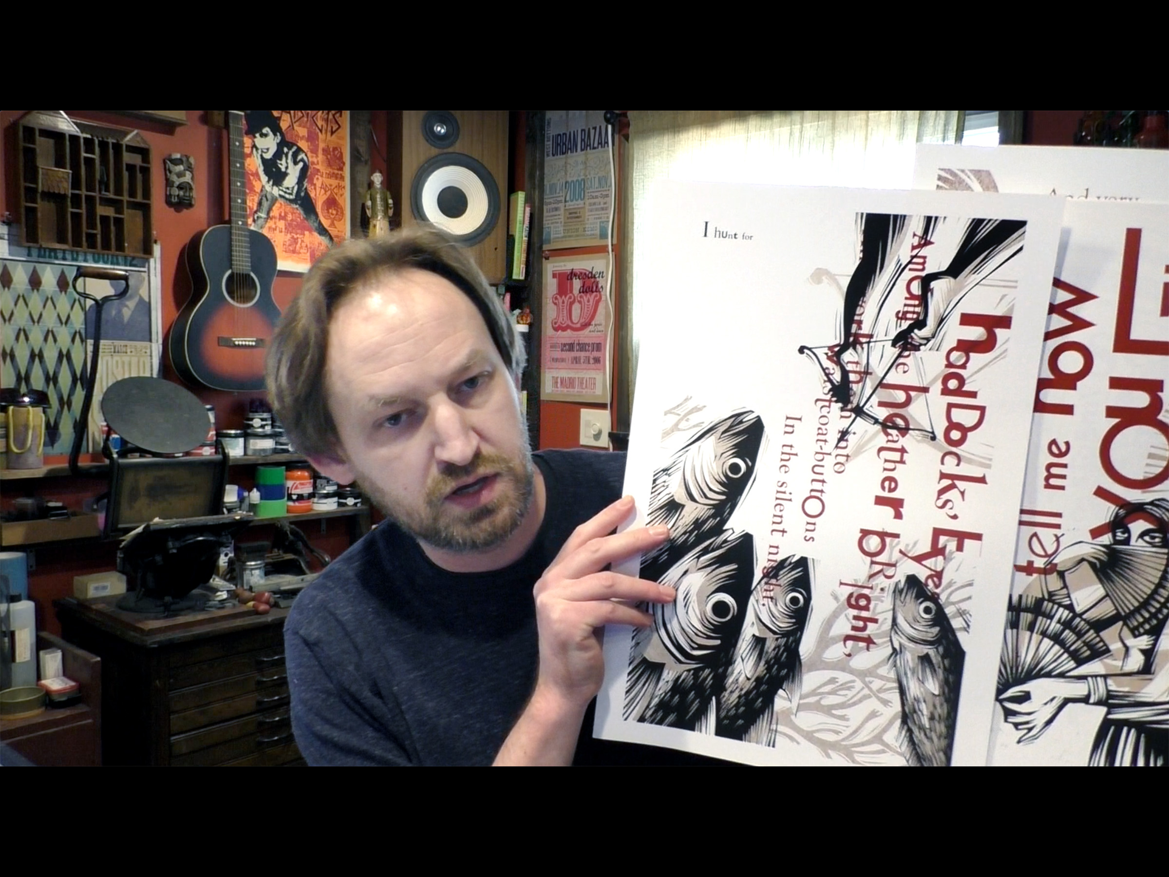
This book is based on the nonsensical poem by Lewis Carroll from a novel Through the Looking-Glass. The poem is a conversation between two people – the narrator and the aged man that the narrator encounters. In this edition, the subject matter of the conversation, as well as the manner of speaking at various stages of the poem, is interpreted through a combination of type and imagery.
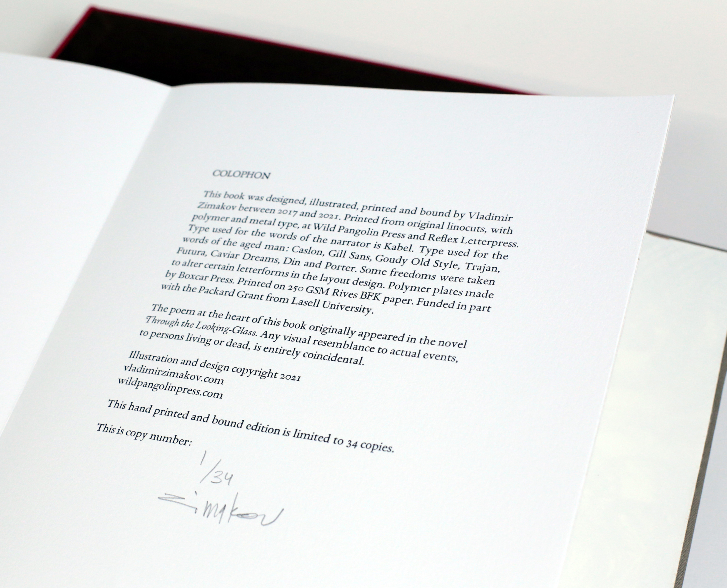
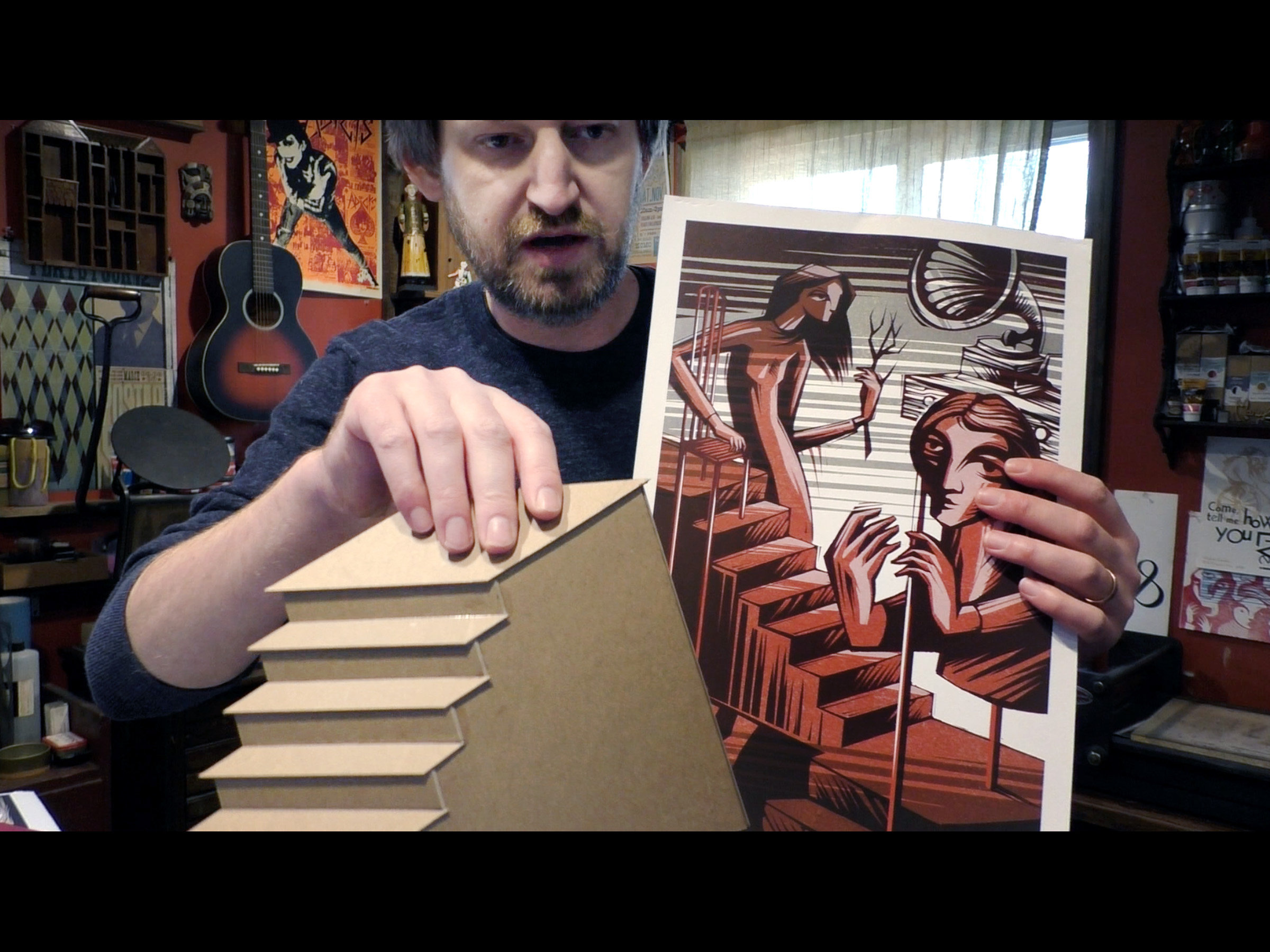
Designed, illustrated, printed and bound between 2017 and 2021. Printed from original linocuts, with polymer and metal type, at Wild Pangolin Press and Reflex Letterpress. Type used for the words of the narrator is Kabel. Type used for the words of the aged man: Caslon, Gill Sans, Goudy Old Style, Trajan, Futura, Caviar Dreams, Din and Porter. Some freedoms were taken to alter certain letterforms in the layout design. Printed on 250 GSM Rives BFK paper. Funded in part with the Packard Grant from Lasell University. Housed in a red & brown slipcase.
Printed in an edition of 34 copies. Signed and numbered by the artist. Dimensions – 12” x 10” x 1.5”; 36 pages.
The price for a copy of Haddocks’ Eyes is $1,200 plus shipping.
For ordering and any additional information, please contact me at vzimakov@gmail.com
A PDF Book Prospectus is available upon request.


Haddocks’ Eyes & Other Adventures in Nonsense Talk
As I am wrapping up the Haddocks’ Eyes project, I’d like to share a talk that I did at Lasell University as part of the Graphic Design League Speaker Series. This happened back in March of 2021. The talk was done virtually and was recorded. Besides discussing the creative process of working on Haddocks’ Eyes, I’ve talked about various things that were happening in the studio during the fall ’20/spring ’21, as well as the things that are on the horizon. Also, quite glad that I was able to touch upon the subjects of Frank Zappa, nonsense literature, drainage pipes, collage aesthetics, my musical abilities, etc.


Here is a link to the lecture recording:
2020 so far
Greetings from the studio, folks!
I hope that this finds everyone well. Quite an interesting year so far, for all of us… Here are a few art updates and some recent developments.
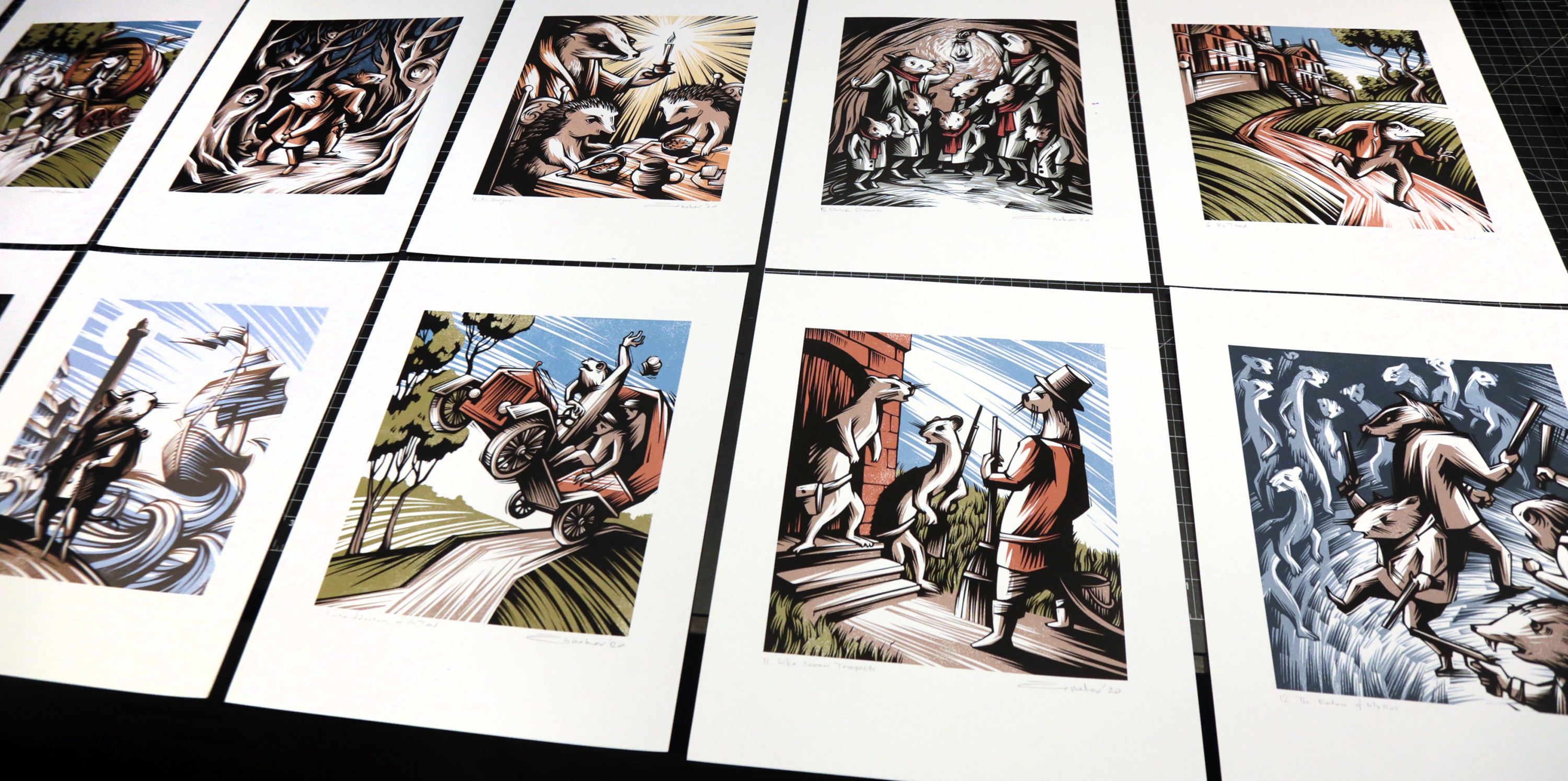
Over the summer I’ve completed all the illustrations for the new limited edition of Kenneth Grahame’s classic The Wind in the Willows. This was a commission from my friends at Mad Parrot Press. 12 full page images and 8 vignettes will appear in the book that is now in production stages. The edition is set to be released by the end of the year. More information about this project and book order info can be found here.

A new edition of Ray Bradbury’s novel Something Wicked This Way Comes is also in the production stages. The book will include 6 of my illustrations and will be released by Centipede Press. This should be an excellent edition with a foreword by none other then Neil Gaiman. Besides my illustrations, it will also feature artwork by David Ho and Matt Mahurin.
On to my own limited edition book project, Lewis Carroll’s Haddocks’ Eyes


The work is going full speed ahead. All the lino plates are carved, type is set (for the most part) and the printing is underway. I’ve been using my studio to print the ghost (sepia) images and Reflex Letterpress in Charlestown, MA for the black ink plates and type. Still considering several binding options and looking to get everything wrapped up by early next year. The book will be in edition of 32. Please drop me a line if you’d like to find out more about this project or are interested in reserving a copy of the book.

In other developments, I have resumed the work based on the short stories by Aleksandr Chayanov. This is a very fluid project with no specific deadline, so I’ve been creating images over several years now, whenever time permits. Those are charcoal drawings, that will eventually be collected in a single publication.

2020 has not been so great in terms of in-person print fairs and exhibits, but there are several upcoming events that I am really excited about. Next week, I’ll be a Visiting Artist at the Kansas City Art Institute. They have invited me for a full day event where I will be presenting my work, do a virtual studio tour, demos and student crits. KCAI is my alma mater. It’s been 20 years since I graduated with a BA degree in Illustration and Graphic Design. So, being invited to present to the new generation of students is quite exciting on many levels!
In November/December, I am taking part in another virtual event – the Los Angeles Printer’s Fair. Looking forward to exhibiting alongside some amazing artists and print makers. This event will take place over two months, so there is plenty of time to check out all the work.
There are also a bunch of other creative projects that are in the works. I am on sabbatical leave this semester, so quite a few new prints and drawings are being conceived and created. I’ll be posting about this separately, once things will start to take shape. Also in the plans is to finally update the portfolio site and the shop. I’ve neglected those for a while.
More to come soon!
Take care and stay safe,
Vladimir

Codex 2019

Well, it looks like the last post on this blog dates back to the previous Codex Book Fair, that occurred two years ago. It definitely has been a while… Art updates on Instagram and Facebook have taken over, and this site has been neglected. I am planning on fixing this moving forward. Although, the above mentioned platforms are great for keeping folks informed on what’s going on in the studio, it is extremely hard to keep things organized, or find something from just a few months ago. Besides, I would really love to share the art process with a bit more of an in-depth look behind the scenes. And that’s what this blog was designed to do. There are quite a few things to talk about. At the moment I am working with three different Presses on several book projects, as well as my own Wild Pangolin Press creation. I will be posting about this as the work unfolds.
On to Codex 2019. As always, this was an amazing time to get together with fellow book artists and printers, see old friends, make new ones and share some recent work.
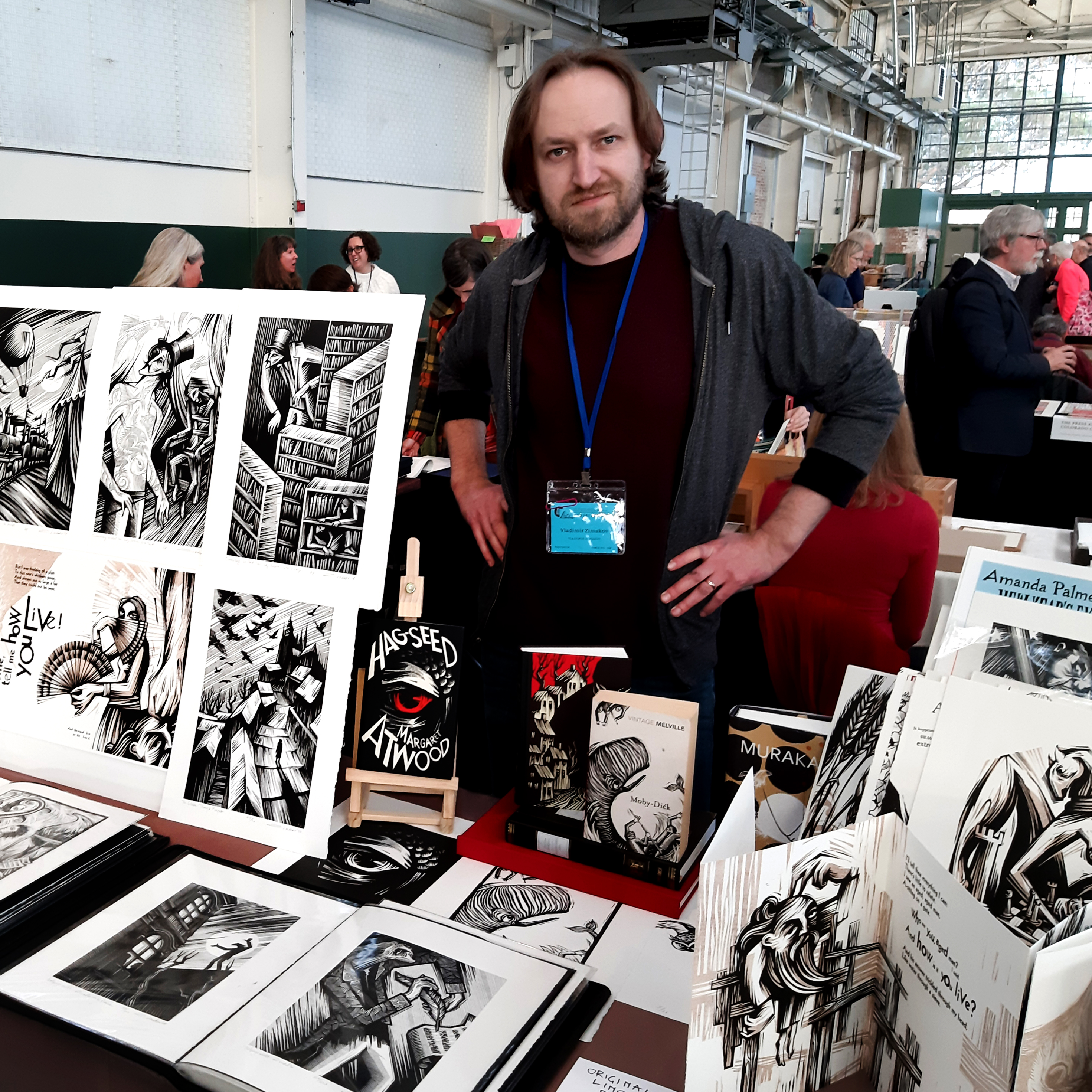
The turnout was amazing. By many accounts this was the biggest Codex Fair yet. Among the new work that I presented were the recently completed (almost) illustrations for Ray Bradbury’s novel Something Wicked This Way Comes, commissioned by Centipede Press. The publication date is yet to be determined. More on this project in the future posts.

Among other recent things was the mock-up of the new project that I am currently working on – Lewis Carroll’s Haddocks’ Eyes. Four spreads from the book were printed and displayed. This one is at the very early stages and many things, like binding, edition and some of the content, are yet to be determined. The plan is to illustrate and typographically interpret the whole poem, which at this point, will consist of 16 page spreads, plus there are other things that I am considering including in the final edition. Here is a quick look:
Besides the Book Fair itself, there were numerous Codex-related events happening throughout the week and the schedule got pretty hectic. So it was especially great to find some time and connect with good friends, the Fine Press printers that I am working with at the moment. To my left is Chad Pastotnik of Deep Wood Press. Currently I am involved in illustrating the new edition of Kenneth Grahame‘s The Wind in the Willows, that Chad will be publishing under the Mad Parrot Press. To Chad’s right are Peggy Gotthold and Lawrence Van Velzer of Foolscap Press. I am working with them on illustrating the limited edition of Andreï Makine’s novel Brief Loves That Live Forever.

More updates on all those projects (and others) will follow shortly. In the meantime, I am getting ready for the Manhattan Fine Press Fair that will take place on Saturday, March 9, 2019. If you are in the area, come by and say hello! More info about the event can be found here.
Photo credits: very top – kavalerka, one bellow – Dima Sayenko, bottom one – a very nice waiter of a very nice Mexican restaurant in Berkeley, CA.
Codex 2017
Here is to another amazing CODEX 2017: International Artists’ Book Fair experience! It was great to see old friends and make new ones, share and see recent work, get new book ideas and collaborations flowing and celebrate the art of the book in all of it’s glory. Many thanks to Peter Rutledge Koch, Susan K. Filter, all the organizers, exhibitors and book admirers for making this happen! Here are a few snapshots that I managed to get while running around and trying to absorb everything. All the rain and me losing my voice for almost two days only added to the experience. Back on the east coast now, shoveling snow and looking forward to 2019!!


Ido Agassi

Ioulia Akhmadeeva

Alex Campos, New York Center for Book Arts

Chad Pastotnik, Deep Wood Press

Dmitri Sayenko, Nikodim Press


DCIM100GOPRO

Jamie Murphy, Salvage Press

Gaylord Schanilek, Midnight Paper Sales

Andre and Anne Chaves, Clinker Press


Peter Koch, the founder of Codex Foundation

Crenway Pavillion, Richmond, CA


A visit to Peter Koch’s amazing print studio

A visit to Peter Koch’s amazing print studio

Artist Reception for the exhibition of artwork by Didier Mutel at Atelier Contakos
Blackstar
On January 10 we got the news… We were in LA then and on KCRW they played Bowie songs all night long. Each one I revisited represented a certain era, a certain feeling in time and a unique artistic achievement. One of the true artists to walk this earth was gone. A couple of days later, I listened to the Blackstar album on a continuous loop and drew.

Excerpts from Nikolai Gogol’s The Diary of a Madman – 10 years

This book that I’ve created as a Grad student at Central St. Martins’ is celebrating 10 years! The experience of creating it was magical and it opened quite a few doors for me. This was my entryway into the publishing, illustration, letterpress and Fine Press book world. The book was handset with metal type, the illustrations were done with linocuts and everything was printed and bound by hand in the college’s print shop and in my tiny room in an East London flat. It took about 7 months from start to finish and I made enough prints for 20 editions of the book. Since then, those books have been exhibited and found their new homes all over the world – England, France, Netherlands, different parts of the States (one of the last ones was on it’s way to Missouri last week).

I’ve done quite a few book projects and have a few in the works right now, but the experience of doing this one is always fresh in my memory. Everything was new. The feel of metal type, sounds of proof presses, smell of printing ink, finger cuts from lino cutters… That feeling of uncertainty, trial and error, constant mistakes and revisions, something completely new, unexpected and real.


