After the draft is complete (see Sketch to Lino Process, part 1). The design needs to be printed out on a laser printer. You will also need CitrSolve solution, a foam brush, bone folder, masking tape, lino block and some paper towels. This is the method I use to transfer the image onto a linoplate:
Category Archives: process
Sketch to Lino Process, part 1
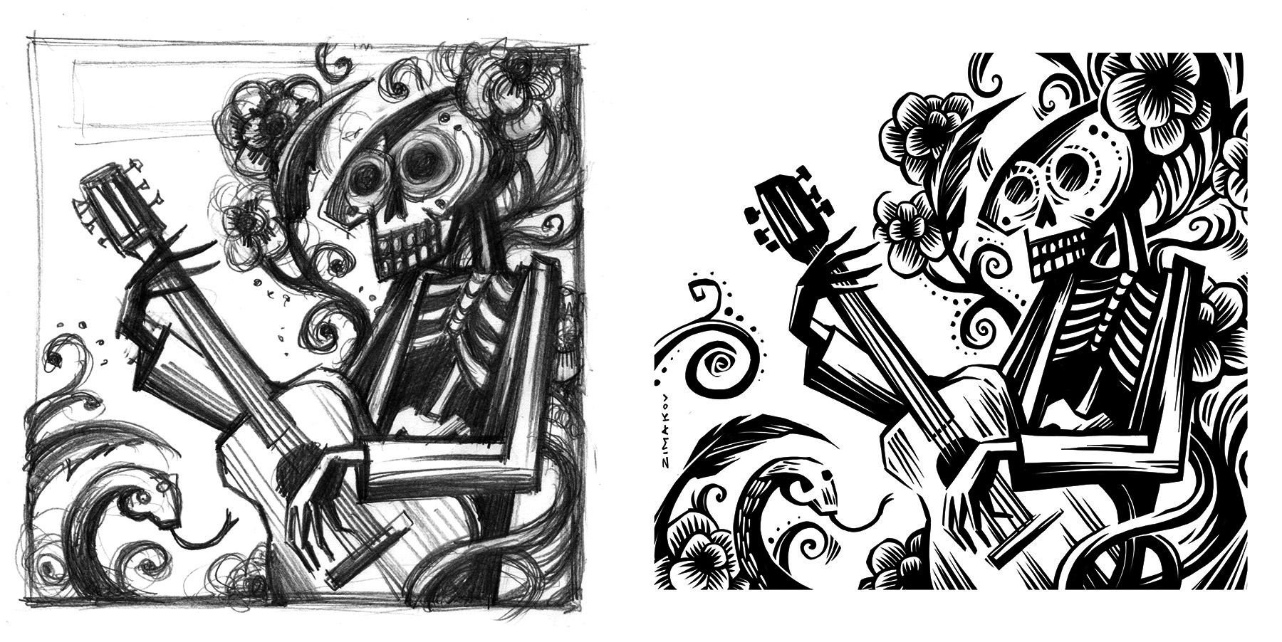
Working out all the details of the composition at the draft stage is quite crucial before moving on to carving the lino. In this part, I will walk you through my approach and in the second part show how I transfer the refined draft on to a lino block.
Some artists prefer more of an expressive approach and can start carving based on a very rough sketch. Some prefer to draw directly on a lino block. I found that resolving all the details of the composition beforehand on paper is quite helpful and will illuminate any miss steps down the road. I prefer to develop the draft in pencil or on a tablet so that it looks very close to the final linocut. There will still be quite a lot of things to improvise on once you start carving, since carving is very different from drawing.
Here is an example of a flower sketch that I’d like to turn into a linocut, including some initial reference photos.
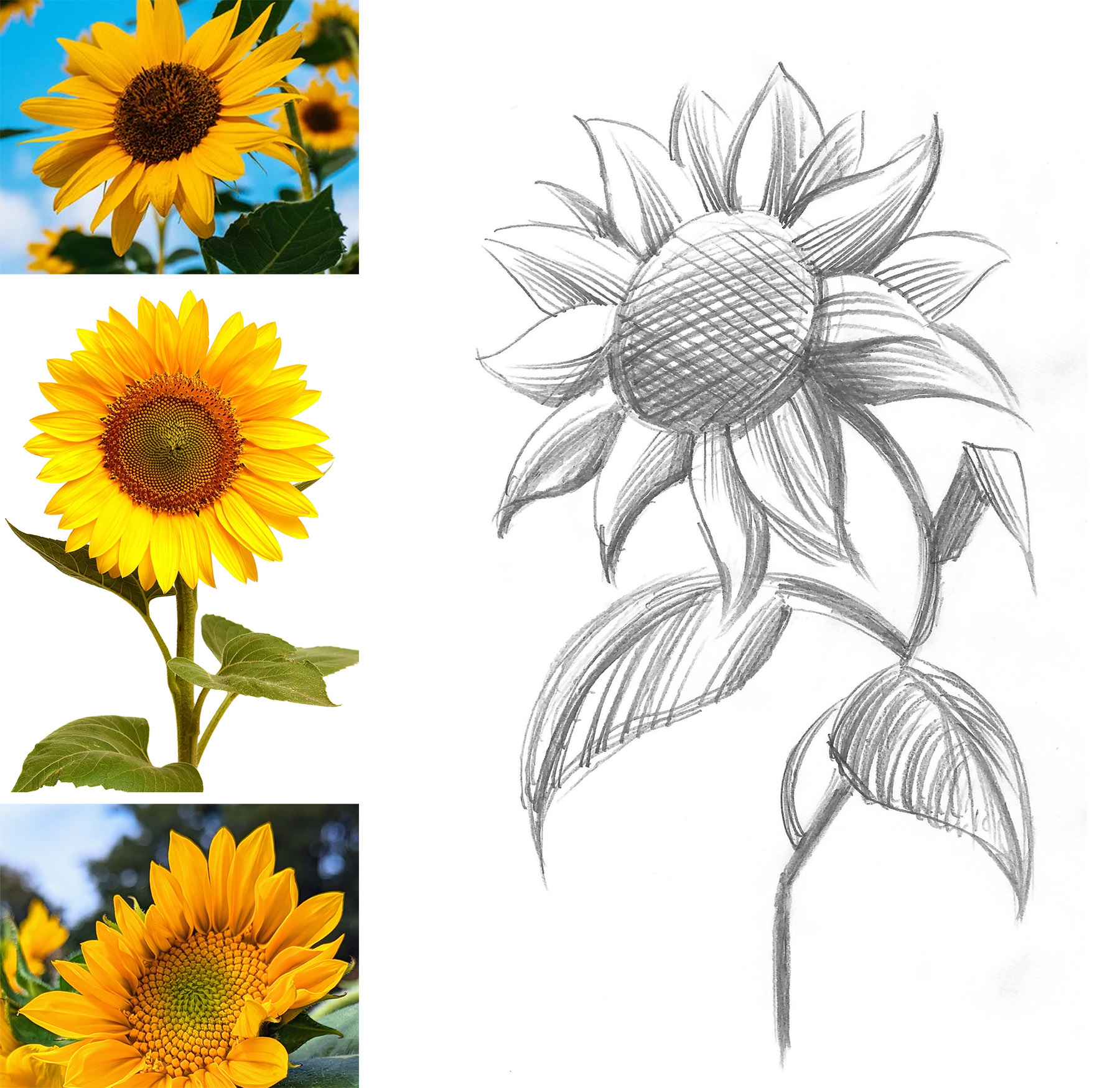
This is just an idea and it doesn’t really give me much clues on how to approach the shading or the cross hatched parts, along with other elements of design. Remember that you can’t really create “greys” in a one color linocut, but you can create an illusion of greys and halftones. Relief printmaking has its own visual vocabulary which is different from drawing or painting. At this point it’s very helpful to do your research and get clues from how other printmakers were able to achieve the results that you are going for. When studying the reference images, it’s important not just to copy the technique, but see what additions you can make to create a more unique, personal look.
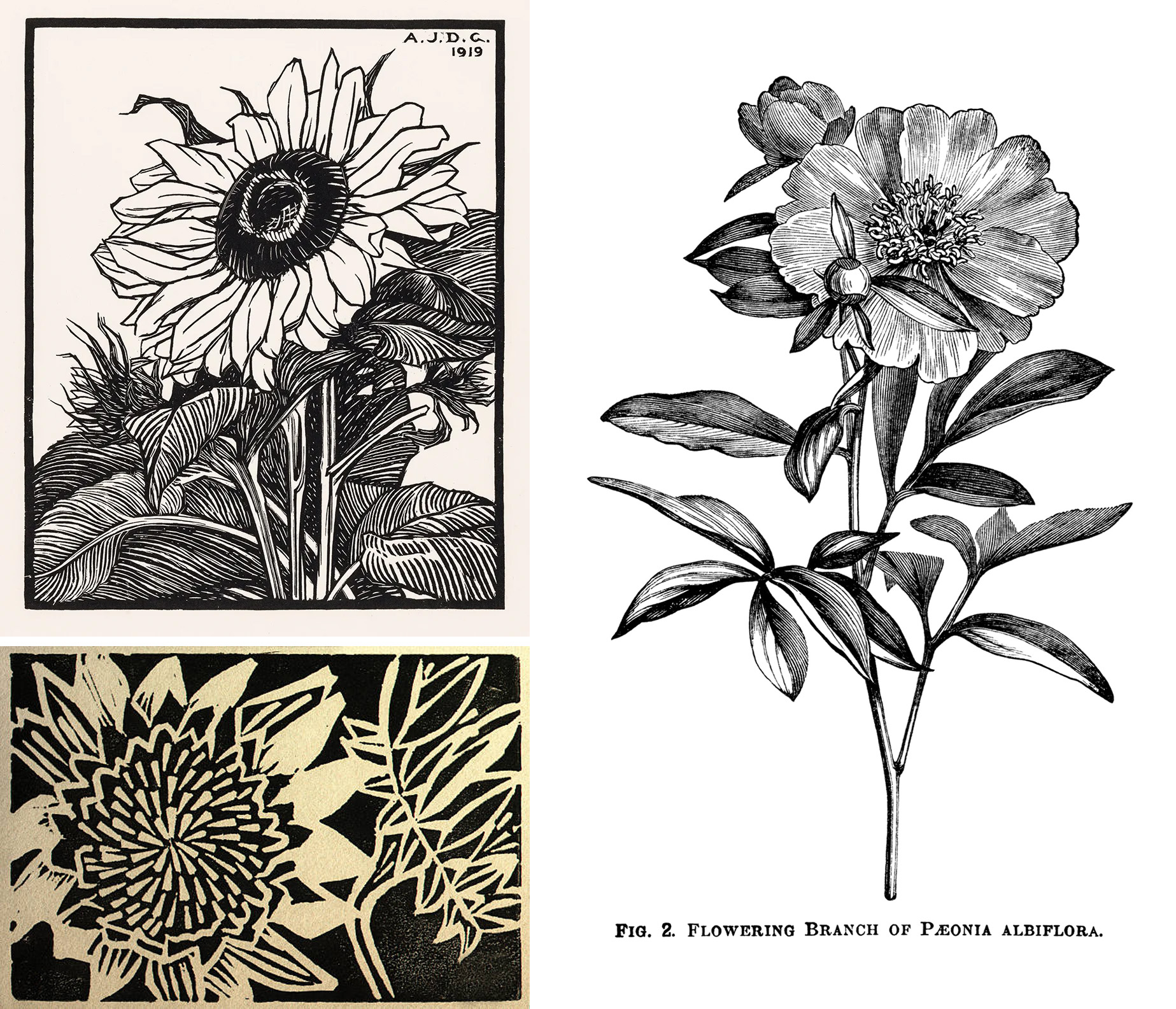
Here are just a few examples of classical plant prints (top left – a print by Julie deGraag, 1919; bottom left and right – artist unknown).
I lay the sketch under the marker paper and start to work out the details. You can see through the marker paper, so that’s really helpful, but it’s not as transparent as tracing paper. So, you can work on a new interpretation while still seeing the original sketch. You can also use regular print paper and a lightbox for this step.
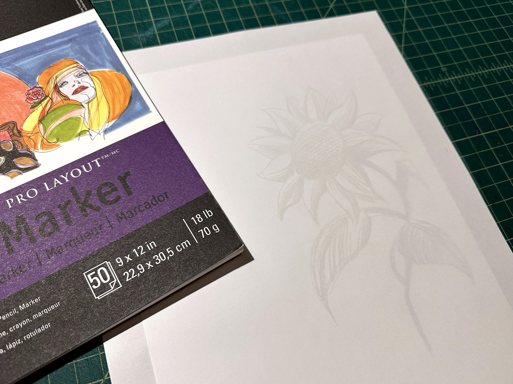
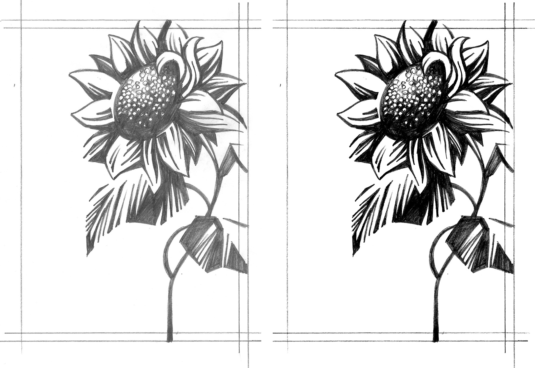
Sometimes I rework the draft several times until everything is how I would like it to be. At this stage I am trying to eliminate the grey tones and just focus on solid black lines and shapes. After the final draft is complete (left image), I scan it and increase the contrast in Photoshop (right image). When the image will be transferred onto a lino block from a printout using CitraSolve solution, it’s important to eliminate all the greys, since they will not transfer – more on this in the next part.
Once I have a solid black and white image, I am ready to transfer it to a plate.
When working on the multi-color print, I still like to start with the solid framework (one plate). Once that’s resolved, I will start to add additional layers that I want to be in color. This can be done on a marker paper or directly in Photoshop. Lately, I have been going over the final pencil drafts on a drawing monitor or iPad pro. It’s easy to create layers and try out different approaches. Below is an example of a sketch and refined draft created in Photoshop using an XP-Pen drawing tablet.
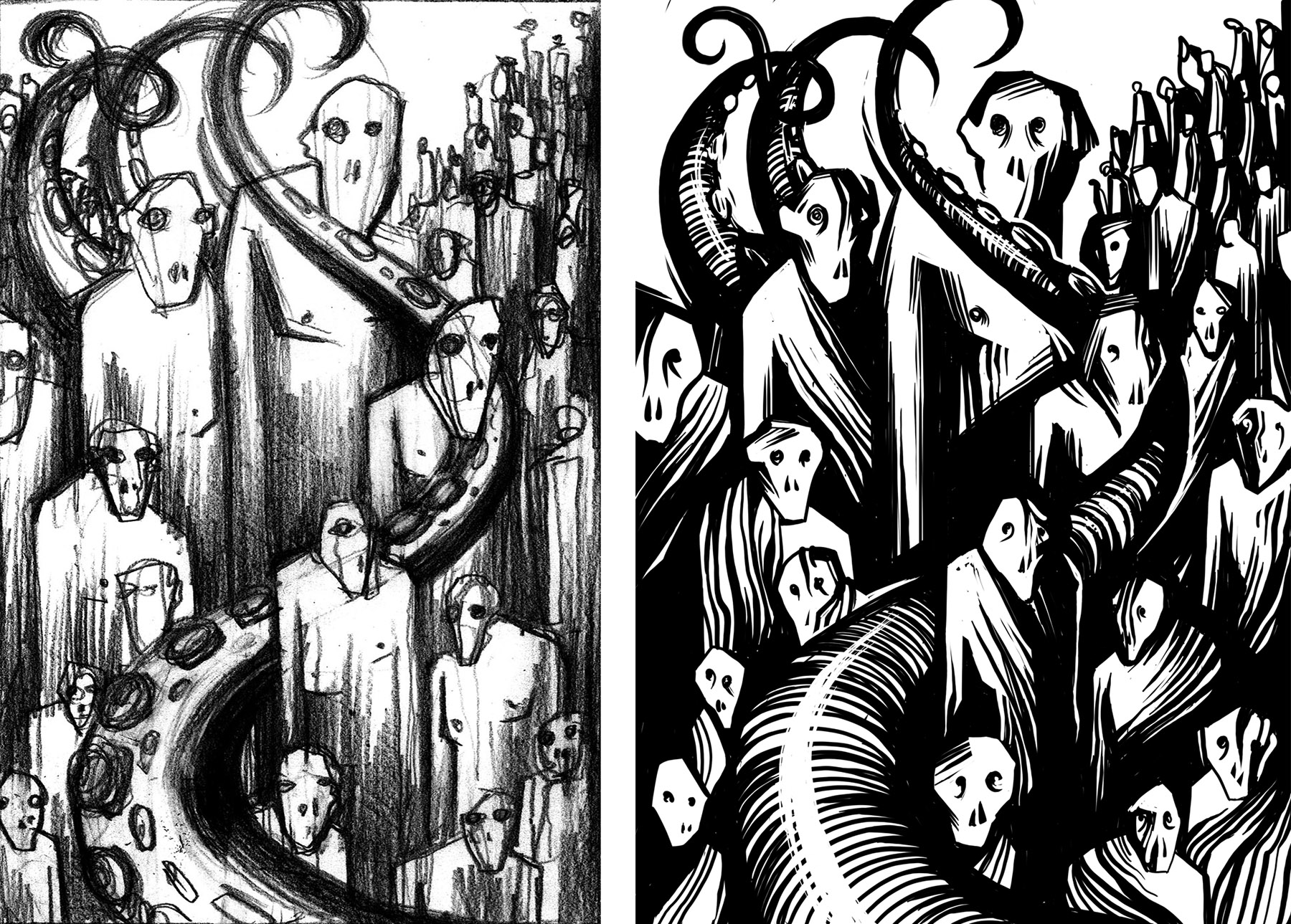
It’s important not to rush things. I usually let the printout of the draft hang in my studio for a few days. Oftentimes, I would make adjustments or add additional elements, while thinking about the final print and the limitations that I might encounter when carving. In the examples below I kept the composition the same, but tried out different textures on the characters to see what will give me the most dynamic composition. The version on the left was used for the final print.
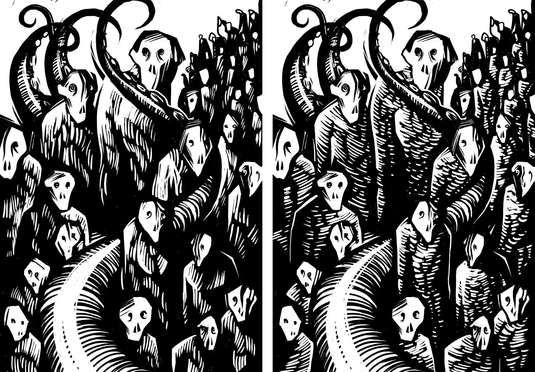
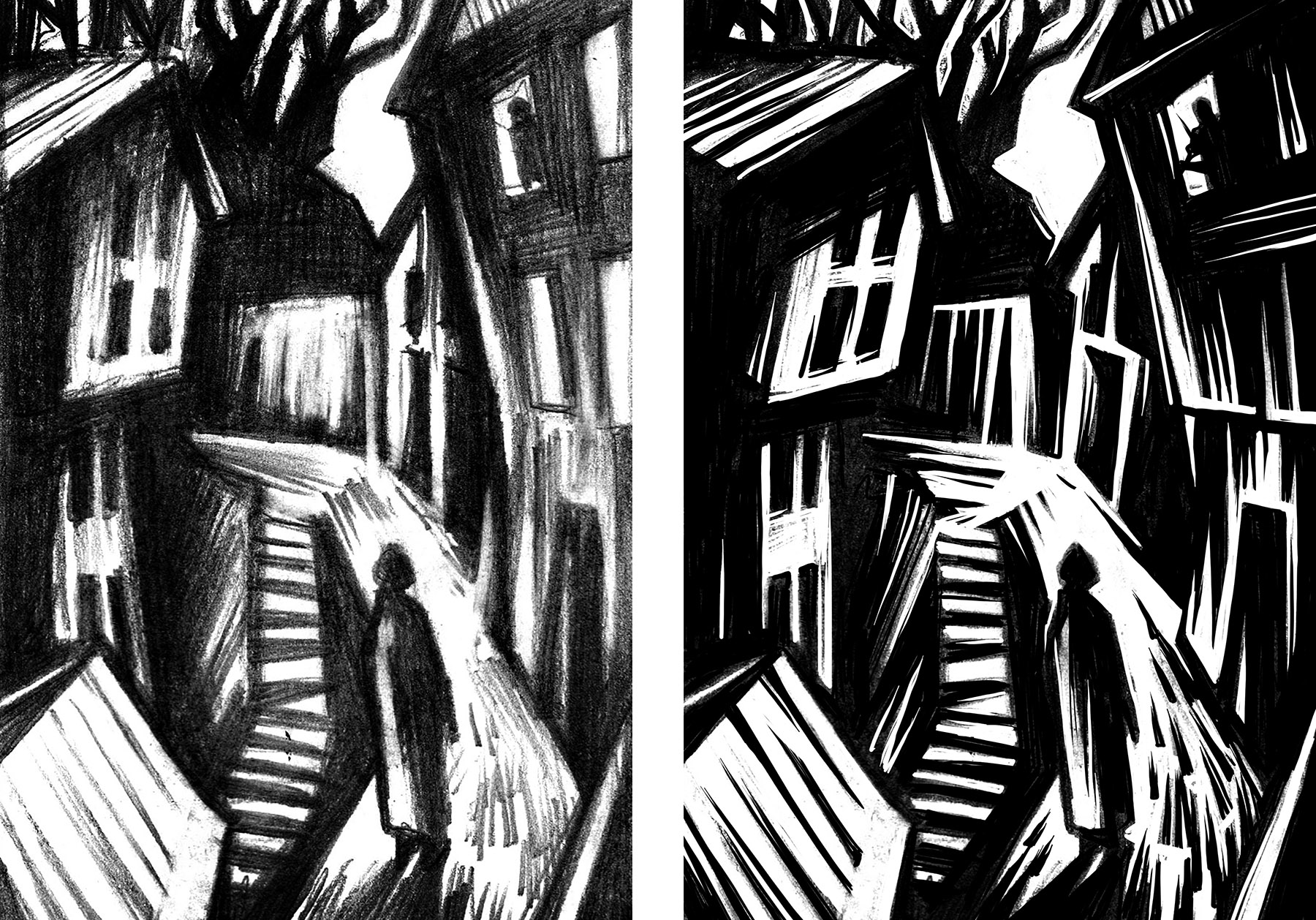
Here are a few more examples of initial sketches and the final draft ready for transferring to a linoplate.
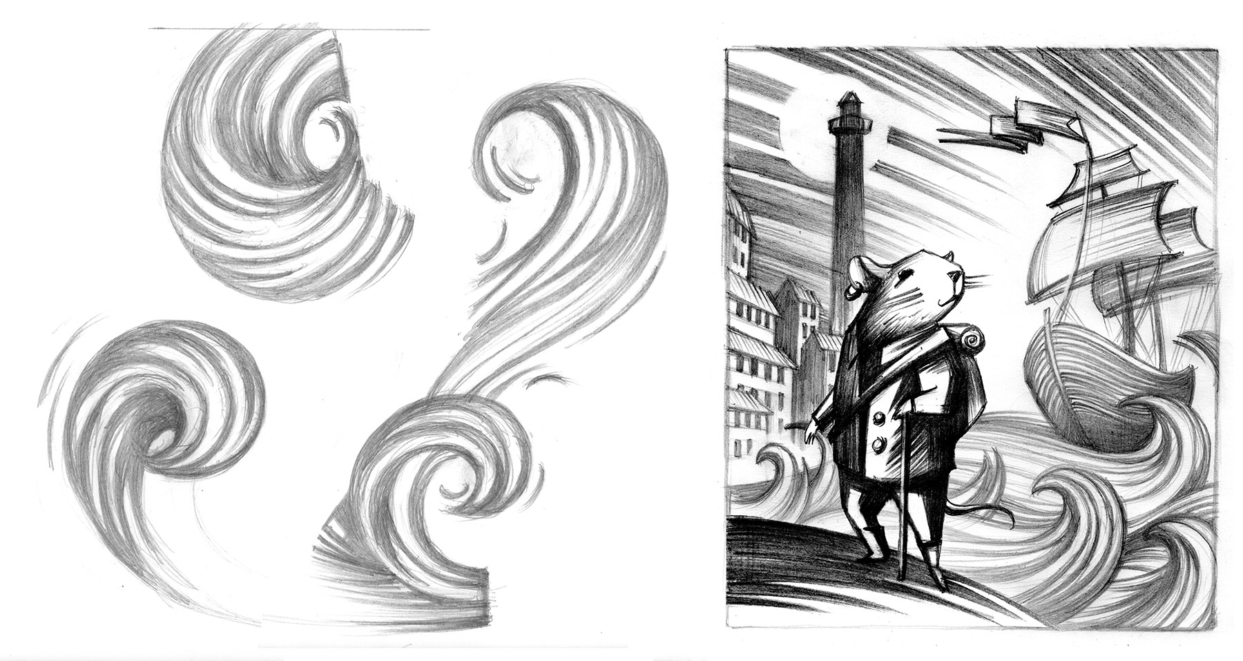
TIP: When working out an element that you haven’t done before in a print, it’s always good to practice various approaches to creating that element. Those are different interpretations of waves and how I applied them in a final composition.
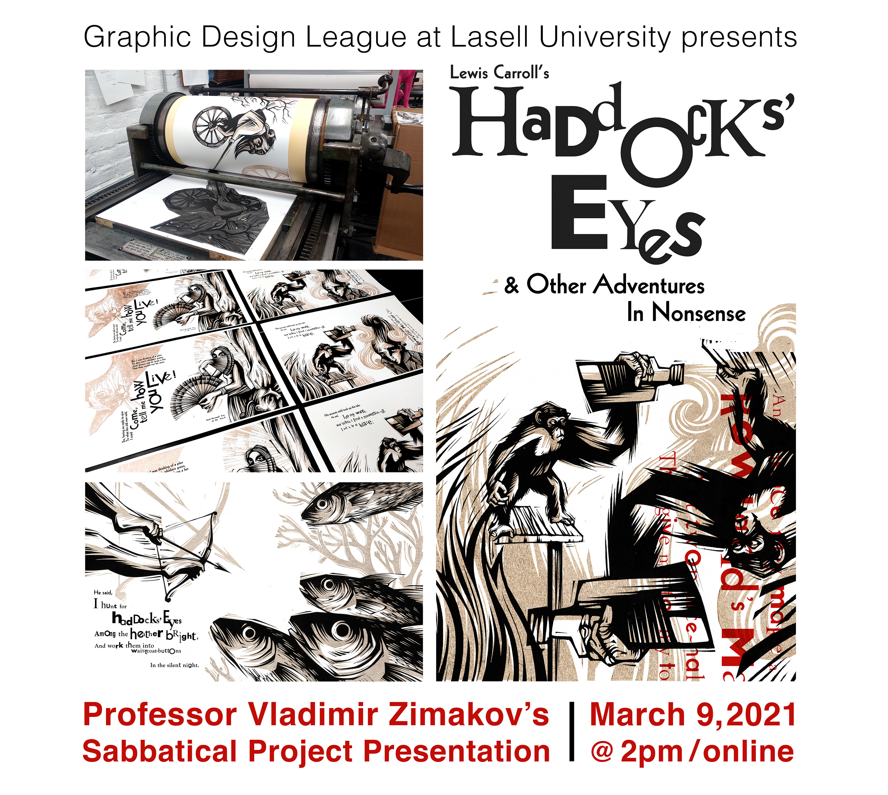
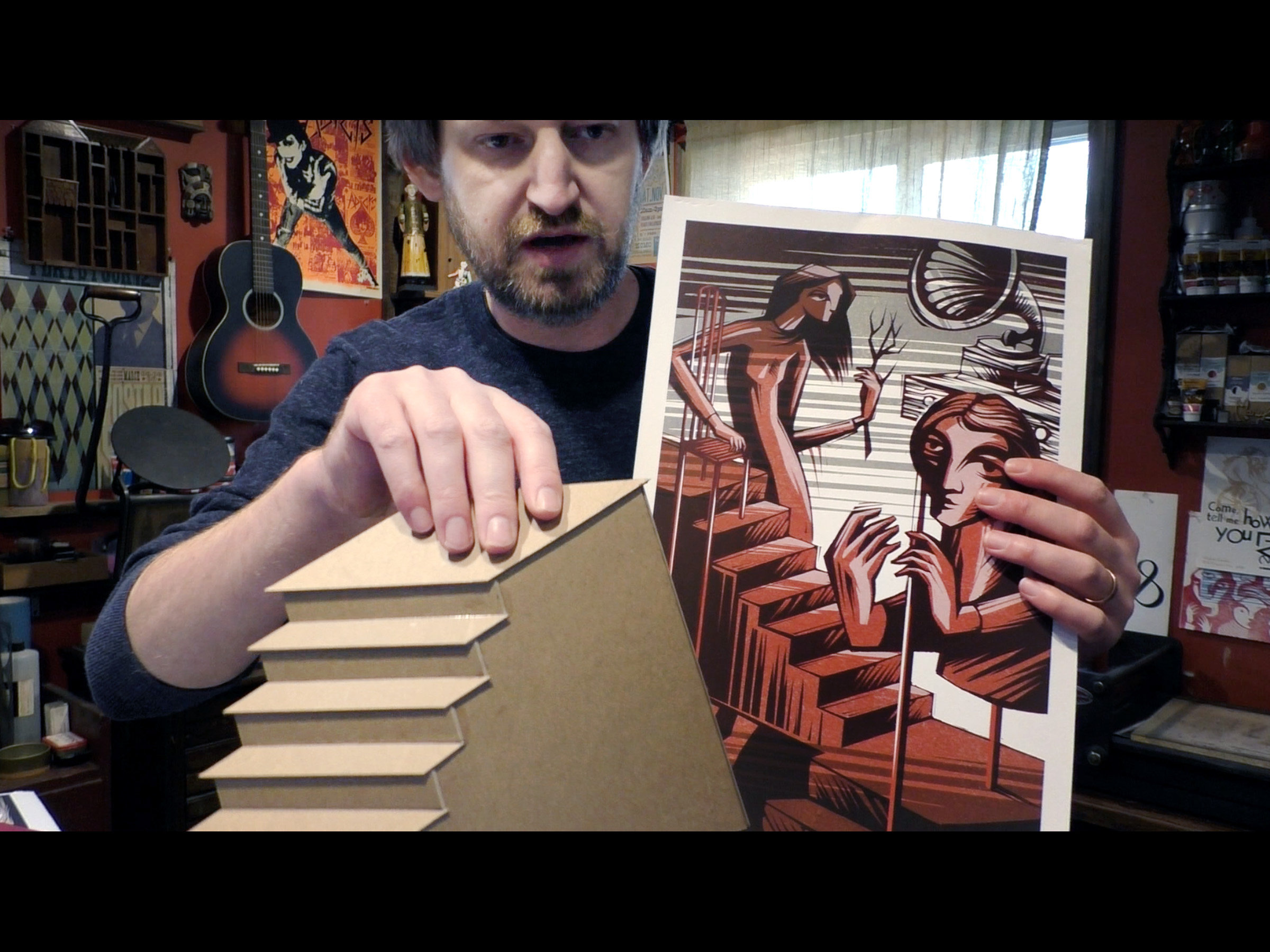
Haddocks’ Eyes & Other Adventures in Nonsense Talk
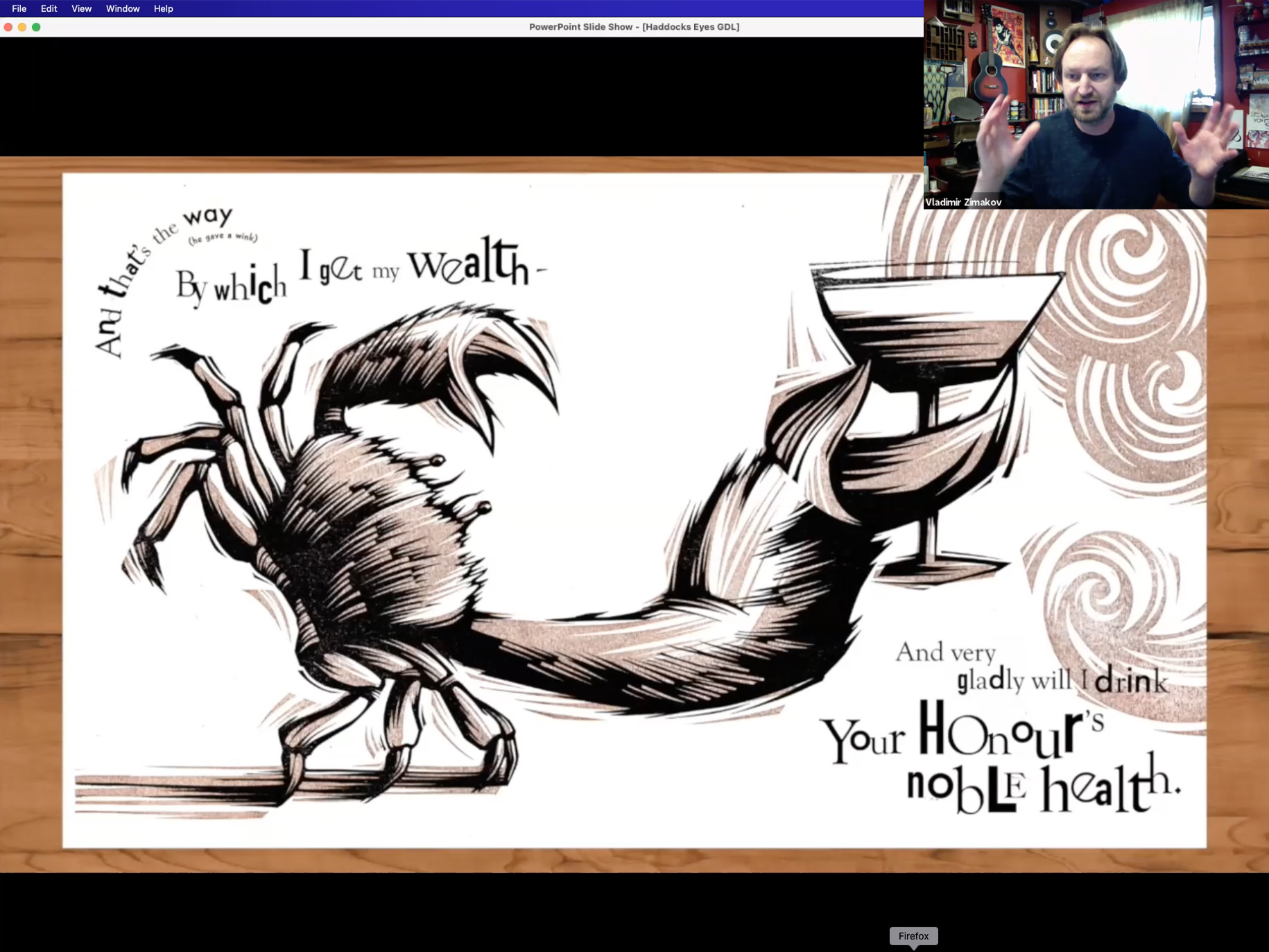
As I am wrapping up the Haddocks’ Eyes project, I’d like to share a talk that I did at Lasell University as part of the Graphic Design League Speaker Series. This happened back in March of 2021. The talk was done virtually and was recorded. Besides discussing the creative process of working on Haddocks’ Eyes, I’ve talked about various things that were happening in the studio during the fall ’20/spring ’21, as well as the things that are on the horizon. Also, quite glad that I was able to touch upon the subjects of Frank Zappa, nonsense literature, drainage pipes, collage aesthetics, my musical abilities, etc.


Here is a link to the lecture recording:

Codex 2019

Well, it looks like the last post on this blog dates back to the previous Codex Book Fair, that occurred two years ago. It definitely has been a while… Art updates on Instagram and Facebook have taken over, and this site has been neglected. I am planning on fixing this moving forward. Although, the above mentioned platforms are great for keeping folks informed on what’s going on in the studio, it is extremely hard to keep things organized, or find something from just a few months ago. Besides, I would really love to share the art process with a bit more of an in-depth look behind the scenes. And that’s what this blog was designed to do. There are quite a few things to talk about. At the moment I am working with three different Presses on several book projects, as well as my own Wild Pangolin Press creation. I will be posting about this as the work unfolds.
On to Codex 2019. As always, this was an amazing time to get together with fellow book artists and printers, see old friends, make new ones and share some recent work.
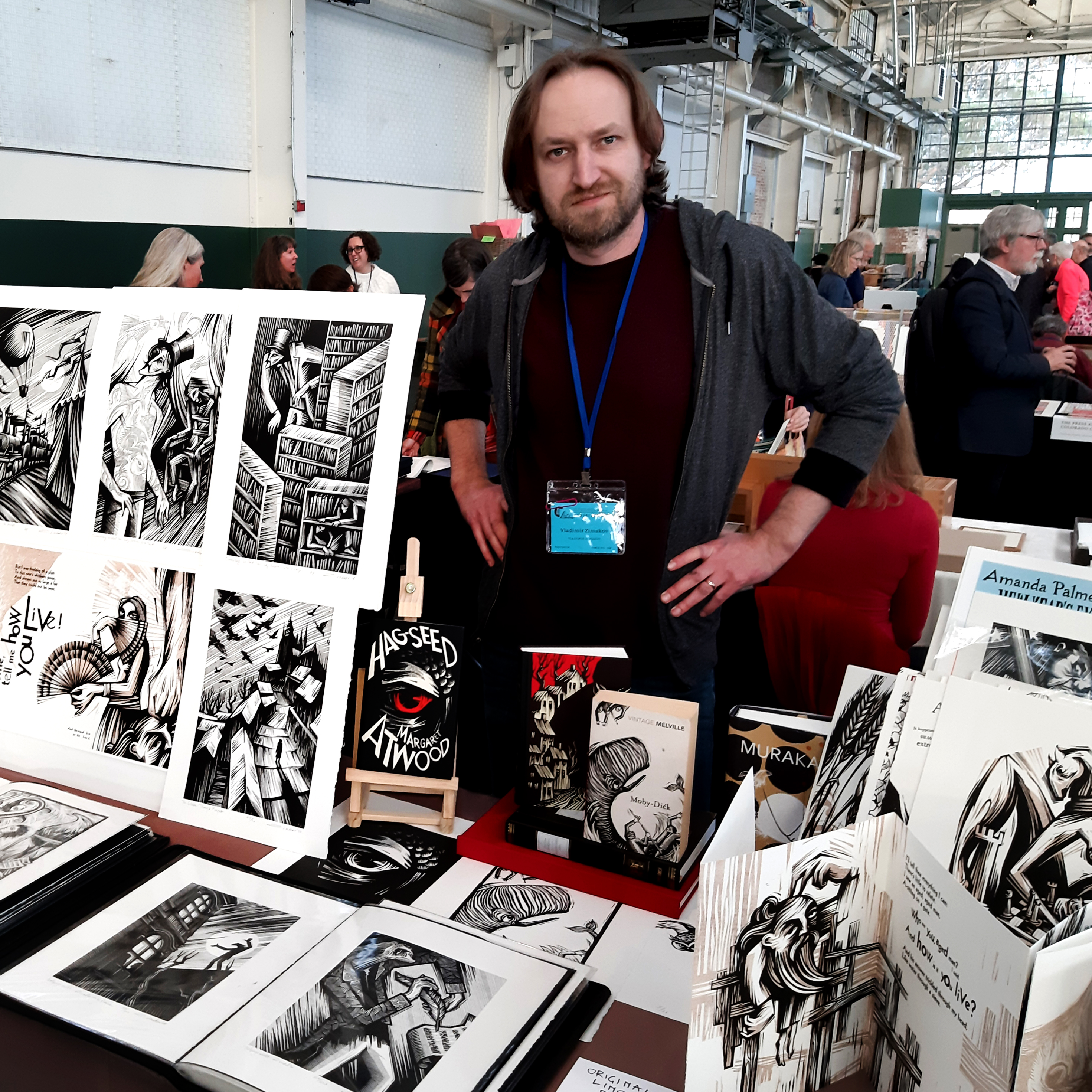
The turnout was amazing. By many accounts this was the biggest Codex Fair yet. Among the new work that I presented were the recently completed (almost) illustrations for Ray Bradbury’s novel Something Wicked This Way Comes, commissioned by Centipede Press. The publication date is yet to be determined. More on this project in the future posts.

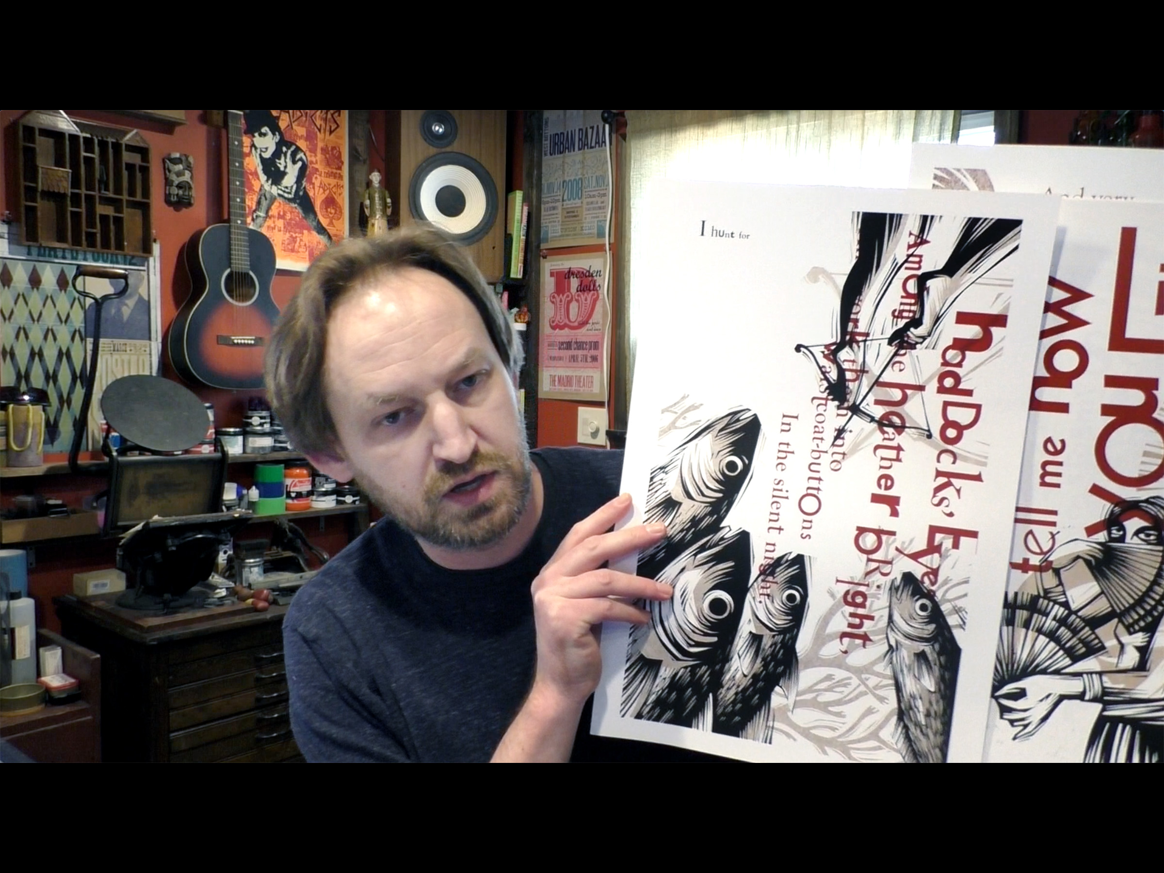
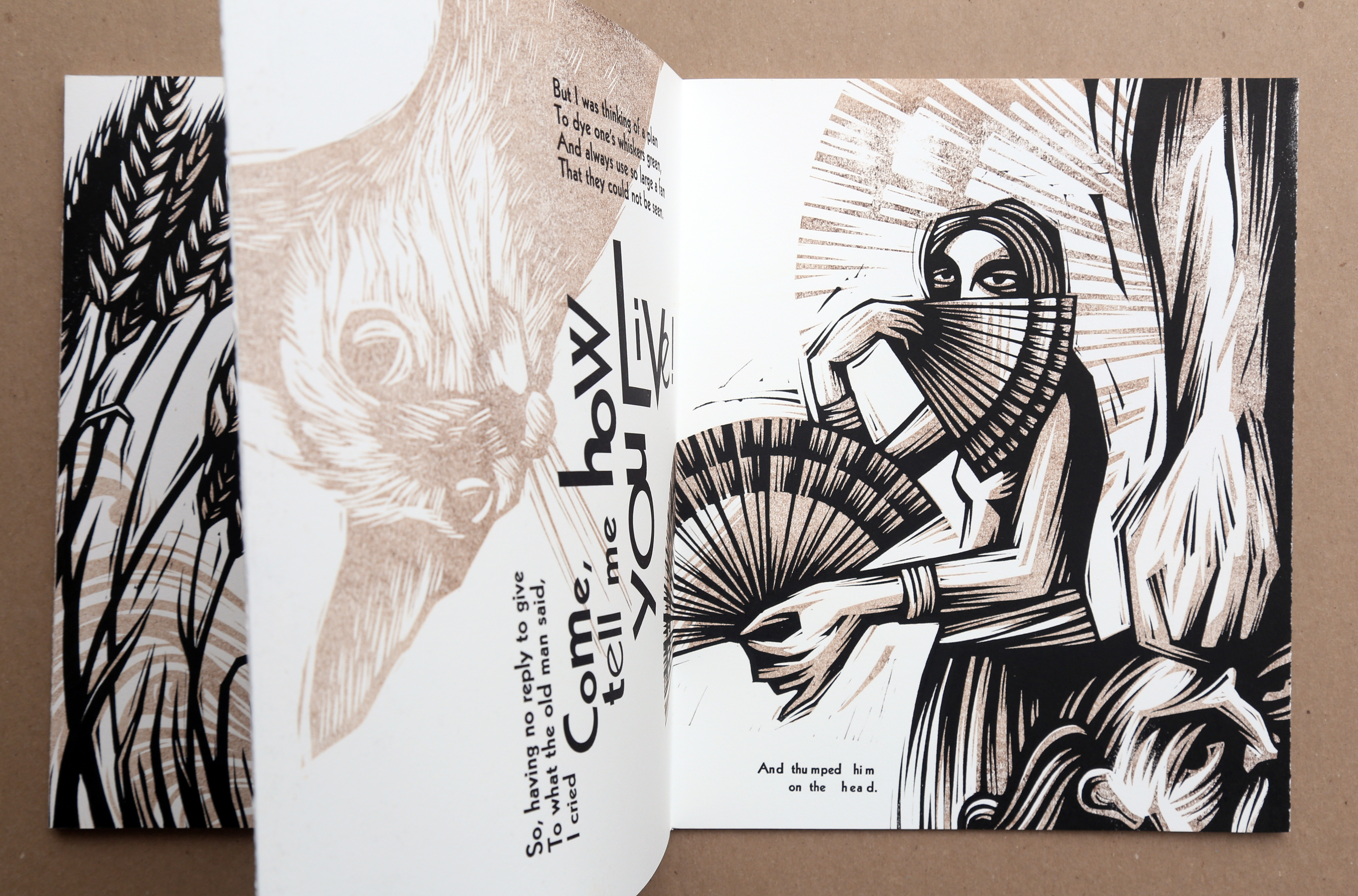
Among other recent things was the mock-up of the new project that I am currently working on – Lewis Carroll’s Haddocks’ Eyes. Four spreads from the book were printed and displayed. This one is at the very early stages and many things, like binding, edition and some of the content, are yet to be determined. The plan is to illustrate and typographically interpret the whole poem, which at this point, will consist of 16 page spreads, plus there are other things that I am considering including in the final edition. Here is a quick look:
Besides the Book Fair itself, there were numerous Codex-related events happening throughout the week and the schedule got pretty hectic. So it was especially great to find some time and connect with good friends, the Fine Press printers that I am working with at the moment. To my left is Chad Pastotnik of Deep Wood Press. Currently I am involved in illustrating the new edition of Kenneth Grahame‘s The Wind in the Willows, that Chad will be publishing under the Mad Parrot Press. To Chad’s right are Peggy Gotthold and Lawrence Van Velzer of Foolscap Press. I am working with them on illustrating the limited edition of Andreï Makine’s novel Brief Loves That Live Forever.

More updates on all those projects (and others) will follow shortly. In the meantime, I am getting ready for the Manhattan Fine Press Fair that will take place on Saturday, March 9, 2019. If you are in the area, come by and say hello! More info about the event can be found here.
Photo credits: very top – kavalerka, one bellow – Dima Sayenko, bottom one – a very nice waiter of a very nice Mexican restaurant in Berkeley, CA.
Excerpts from Nikolai Gogol’s The Diary of a Madman – 10 years

This book that I’ve created as a Grad student at Central St. Martins’ is celebrating 10 years! The experience of creating it was magical and it opened quite a few doors for me. This was my entryway into the publishing, illustration, letterpress and Fine Press book world. The book was handset with metal type, the illustrations were done with linocuts and everything was printed and bound by hand in the college’s print shop and in my tiny room in an East London flat. It took about 7 months from start to finish and I made enough prints for 20 editions of the book. Since then, those books have been exhibited and found their new homes all over the world – England, France, Netherlands, different parts of the States (one of the last ones was on it’s way to Missouri last week).

I’ve done quite a few book projects and have a few in the works right now, but the experience of doing this one is always fresh in my memory. Everything was new. The feel of metal type, sounds of proof presses, smell of printing ink, finger cuts from lino cutters… That feeling of uncertainty, trial and error, constant mistakes and revisions, something completely new, unexpected and real.


You Must Go and Win!

This is one of several posts to come that will talk about my work with Alina Simone. Alina is an amazing person, musician and writer from New York City. We’ve met back in 2002 at one of her shows in Brooklyn. We’ve been in touch ever since. Over the years, I’ve designed a few CD and vinyl jackets for her albums, as well as a tour poster. In 2010 her collection of essays was going to be published by Faber & Faber.
At first Alina asked me to do a mini-graphic novel insert for the book. Then I was approached by Charlotte Strick, the Art Director at Faber & Faber and a wonderful designer, to do the cover art.

Above is a little glimpse of the graphic insert that I did for the book that illustrates the life and times of Yanka Dyagileva, a Russian musician who had a huge influence on Alina (she actually recorded an album of Yanka’s cover songs a few years ago). In the future posts I’ll talk more about the process of creating those illustrations. I wanted to share a small part of it now, since one of the main graphic elements for the cover was inspired by the depiction of the smoke coming from the smokestacks, a typical scene of any small industrial Russian town.

Here is a little excerpt from the synopsis of the book:
“In the wickedly bittersweet and hilarious You Must Go and Win, the Ukrainian-born musician Alina Simone traces her bizarre journey through the indie rock world, from disastrous Craigslist auditions with sketchy producers to catching fleas in a Williamsburg sublet…”
The writing was great! After reading the first chapter and discussing the book with Alina and Charlotte, I knew that the cover needed to capture a lot: humor, irony, tragedy, the setting of the main events and the overall tone of the book. Alina had this idea of having an amp on fire, which would be symbolic of a lot of things that she talks about in the essays. Charlotte suggested to try and use the type in a similar way that I have used it in one of my previous projects, “The Book of Sound”.
I got down to work and presented a few drafts. Though we went with the idea of the amp on fire, the other ones didn’t go to waste. The draft on the right has inspired the cover for Alina’s next album.

The title of the book and author’s name were originally done on a letterpress using wooden type. Once again, I’ve used the facilities at the Otis Lab Press, gathered letterforms of all shapes and sizes and made a bunch of prints.


Later those impressions were scanned and digitized. The prints themselves were almost eaten by my daughter.

Once the typography was resolved, I moved on to carving the lino to create the main image of the smoke and the amp.

Those I printed in the studio using my little etching press. One of the challenges with the image came up as I was working on the smoke and the typical Russian church domes, that we decided to use for the cover. Since the domes are used so much to represent Russia, my job was to give them enough subtlety so the image would not appear to be cliche.

I used the technique of “ghost printing” (when the plate is run through the press several times before the final impression is made) in order to achieve this. The smoke and domes started to appear distant and ghostly, yet still had the necessary presence.


The image was designed to wrap around the spine and go on to the back. Here’s the final file combining the physical print and type.

You will notice that the final cover includes a quote by Neil Gaiman. An interesting coincidence is that I was introduced to Neil around the same time I saw that quote on the cover for the first time.
Did I mention that this book is great? It is! Get your copy here.
The Call of Cthulhu in 3D

Back in 2010 I was approached by Matthew Broughton, a senior designer at Vintage, to do a cover for The Call of Cthulhu by the great H.P. Lovecraft. This was going to be one in a series of 5 classics that they were releasing that year that would feature a 3D cover. This was the really cool part! Each book would come with a pair of 3D glasses and obviously the cover needed to be dimensional. I was quite intrigued by this challenge and got down to work.

After brainstorming, a few pencil sketches and ink drafts, I moved forward with the lino. In addition to the image, we decided that the title should also be carved out.


I usually print proofs and drafts on my little etching press in the studio, the final printing in this case was done at the Otis Lab Press on one of their Vandercooks.

Once everything was printed, scanned and digitized, I skewed the type a bit to give it more of a dramatic look and make it fit with the image more. At this point the trick was to get the image working with the 3D glasses (final version on the right).

After some internet research and looking through tutorials I reached out to my good friend Jim Campbell for some tips with this. Jim’s an expert. He collects antique photographs and gives them a 3D effect (some of this stuff can be seen here). Jim was quick to respond with some pointers.

Then it was on to more Photoshop for me. I first broke down the image and title into many layers, depending on how close or far I wanted them to appear. Bellow are the two main separations, but there are quite a few little sub layers within them. Those were placed on top of one another using the Multiply blending mode (third image).

From that point on it was a matter of sitting in front of the screen for a few hours with the 3D glasses on and shifting layers left and right, up and down. Don’t want to get too technical here. The main trick is this: the more the red and cyan layers are off-register, the closer that part will appear to the viewer, the more they are in line with each other – the farther the image will be.

If you get your 3D glasses out you can see the effect, however your monitor colors might be off. So the best thing to do is get the book and see it in person. The 3D glasses come with it!
Amanda Palmer – The Alchemist
A few months ago, the awesome and amazing musician/performer/poet Amanda Palmer (formerly of the Dresden Dolls, now performing solo with a new band The Grand Theft Orchestra) reached out to me to create some art for her upcoming book and tour. Her plan was to get a bunch of artists to create visual interpretations of her new songs and herself. The results were going to be compiled in a book that would be coming out around the same time as her new album. In addition to this, she was going to do a set of acoustic performances/gallery shows where the art would be exhibited. Being a fan of such artistic collaborations and AFP, I jumped to the task! As a result, two pieces were created – one based on the song (more on that in the future post) and one depicting Amanda:

So as far as the process goes… Bellow are some images of Amanda that provide just a tiny glimpse into her personality. Her live shows are incredibly theatrical and electrifying, going way beyond being defined by any one genre. The lyrics are smart, sharp, funny and poignant.

Bellow is the initial sketch that I have actually done a year ago while working on some t-shirt designs for Amanda. Since that time, I’ve gotten to know and understand her art and music a little better. While coming up with ideas, some old medieval alchemy images started to come to mind (like the one on the right). The final result turned out to be a hybrid of those two approaches.

The initial image was a linoleum cut (on the left), actual print (on the right).
 After scanning the print into Photoshop, I’ve started to think of how this could appear in color. I broke the image down to three colors and also added a background layer of the smoke in the background. Bellow are the four files I’ve used to create the screens from, initially deciding that one is going to be black, the other brown, next one dark green and the last one light blue. Some of those would overlap when printed.

And here’s how it all started to come together when the screens were all done and the printing process had begun.

As always, the plan was to crank this out in one night. As it happens, it took two whole nights just to get all the inks mixed and figured out. Of course there were little surprises along the way. This time after spending a few hours coming up with a perfect color combination I had to throw the inks out and start from scratch, simply because those particular inks would not cooperate with the paper.

Working my way from background to foreground, light to dark. The final pass was the black layer.

And here are a few detail shots.


This is the print alongside the one I’ve made for one of the songs.

Since sending those out to Amanda’s headquarters they have traveled to London, Berlin, Paris, San Francisco, Los Angeles and Boston. They are also now available at Etsy for sale. Bellow is a picture of Amanda in front of them at one of the gallery show events (I believe that one is from London). More on those events, shows, the book those will appear in and the art talk that Amanda and I did in San Francisco a bit later.

