Random Turns Exhibition at TurnPark Art Space

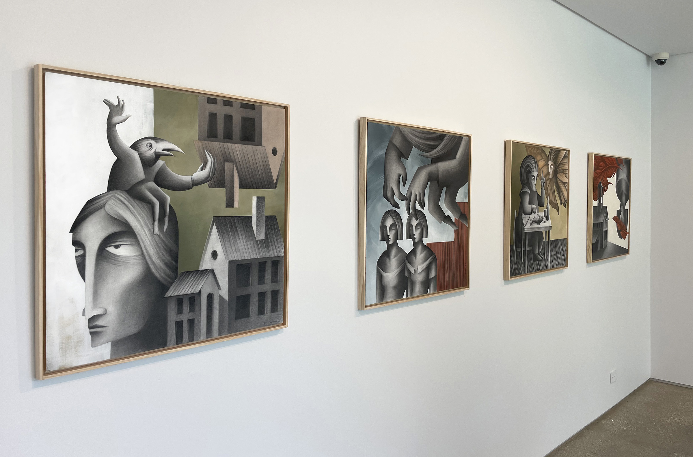
My solo exhibition Random Turns is now on view at the beautiful TurnPark Art Space, located in West Stockbridge, MA. The exhibition features new drawings, structures and prints that were created this year. The work will be on display through October 31st, with the opening reception and artist talk taking place on Saturday, September 16, 4 to 6 pm. This will be followed by an afterparty and live music in the park.

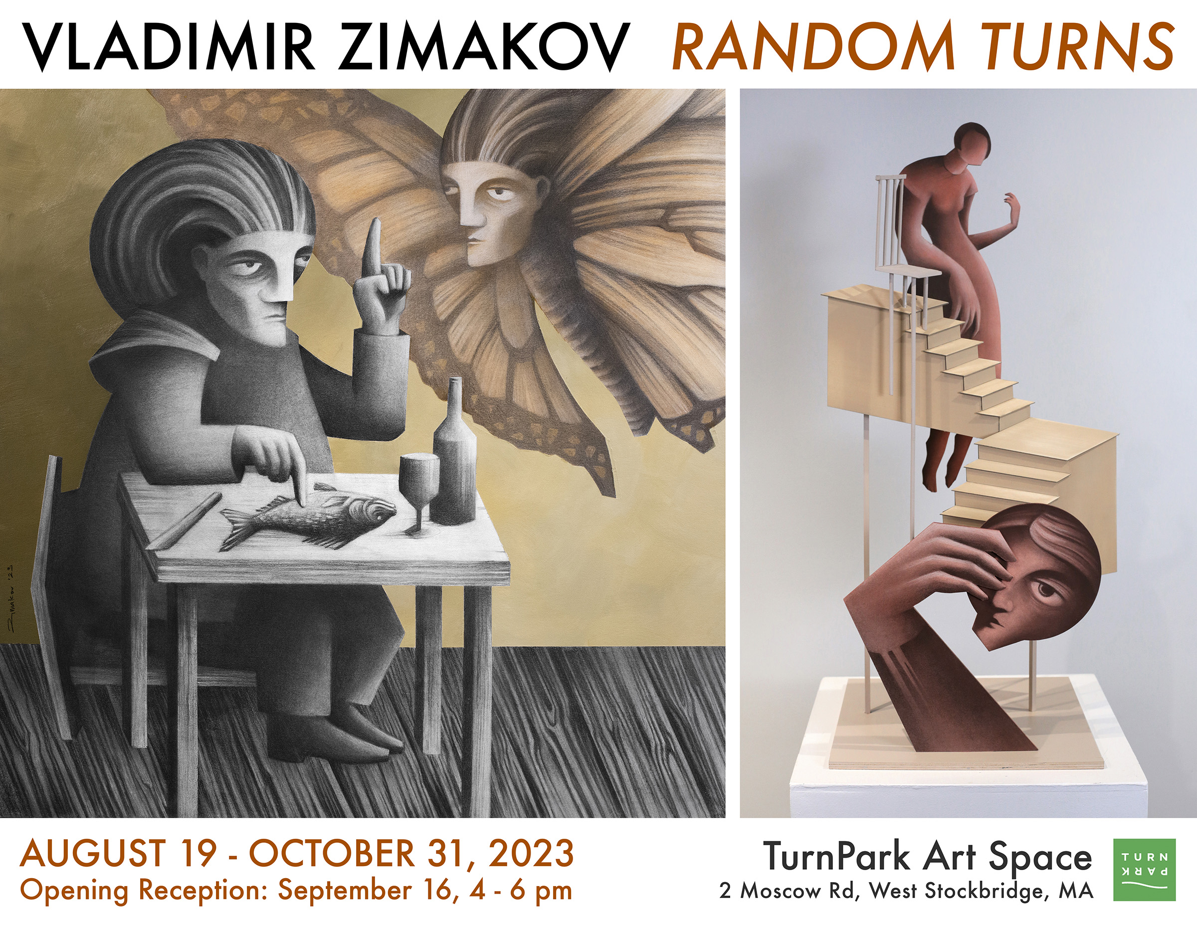
From the Artist’s Statement: Vladimir’s work captures imaginary moments and narratives based on emotions, intuition and irrationality. Concepts such as inspiration, obsession, temptation, irony and madness are transformed into concrete and vivid images, where various characters are assembled to interact with each other and their environment. Common occurrences are juxtaposed with absurd and nonsensical situations. The artist attempts to make sense of our own actions and interactions through visual metaphors and humor, often going beyond logic and reason.

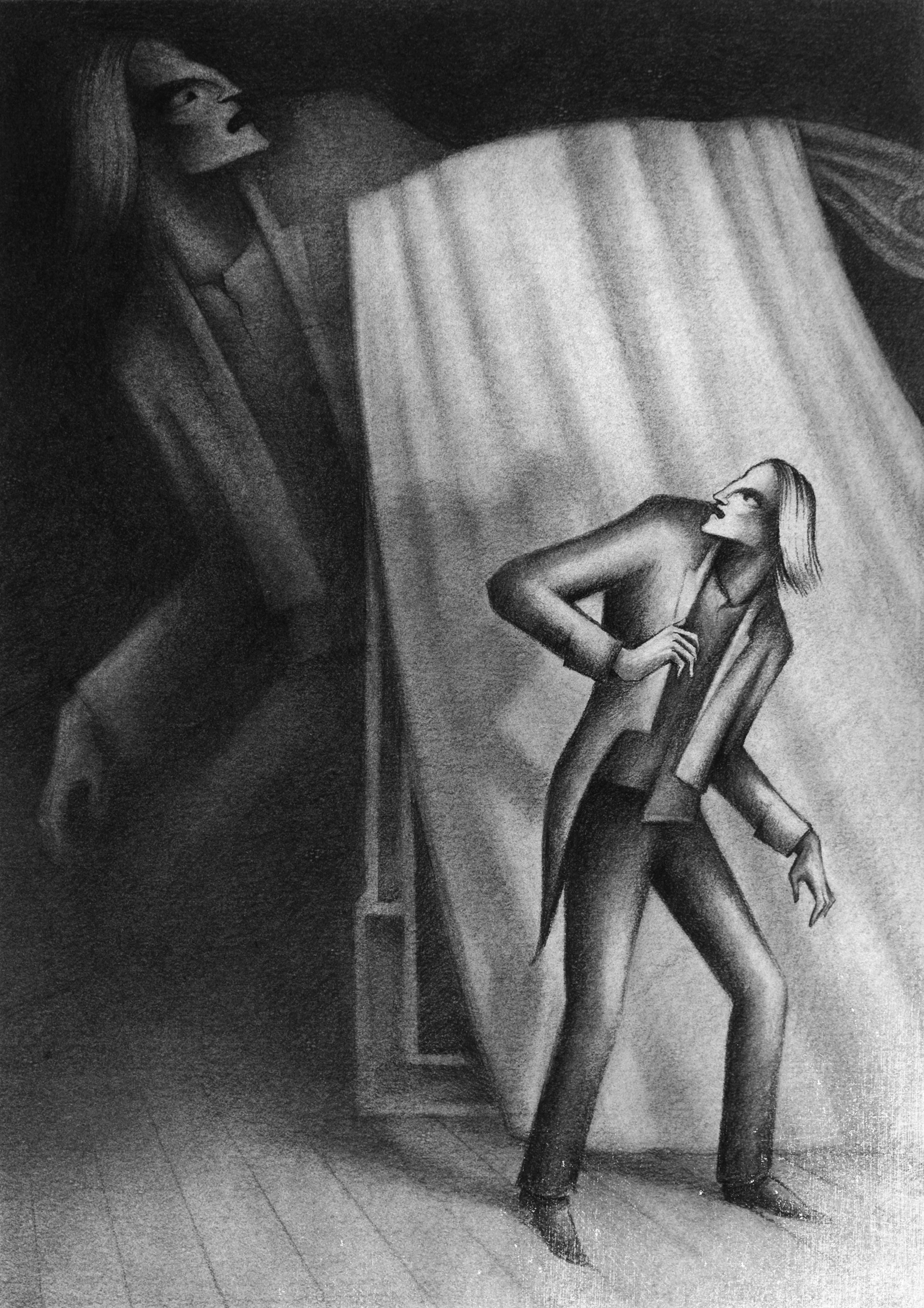
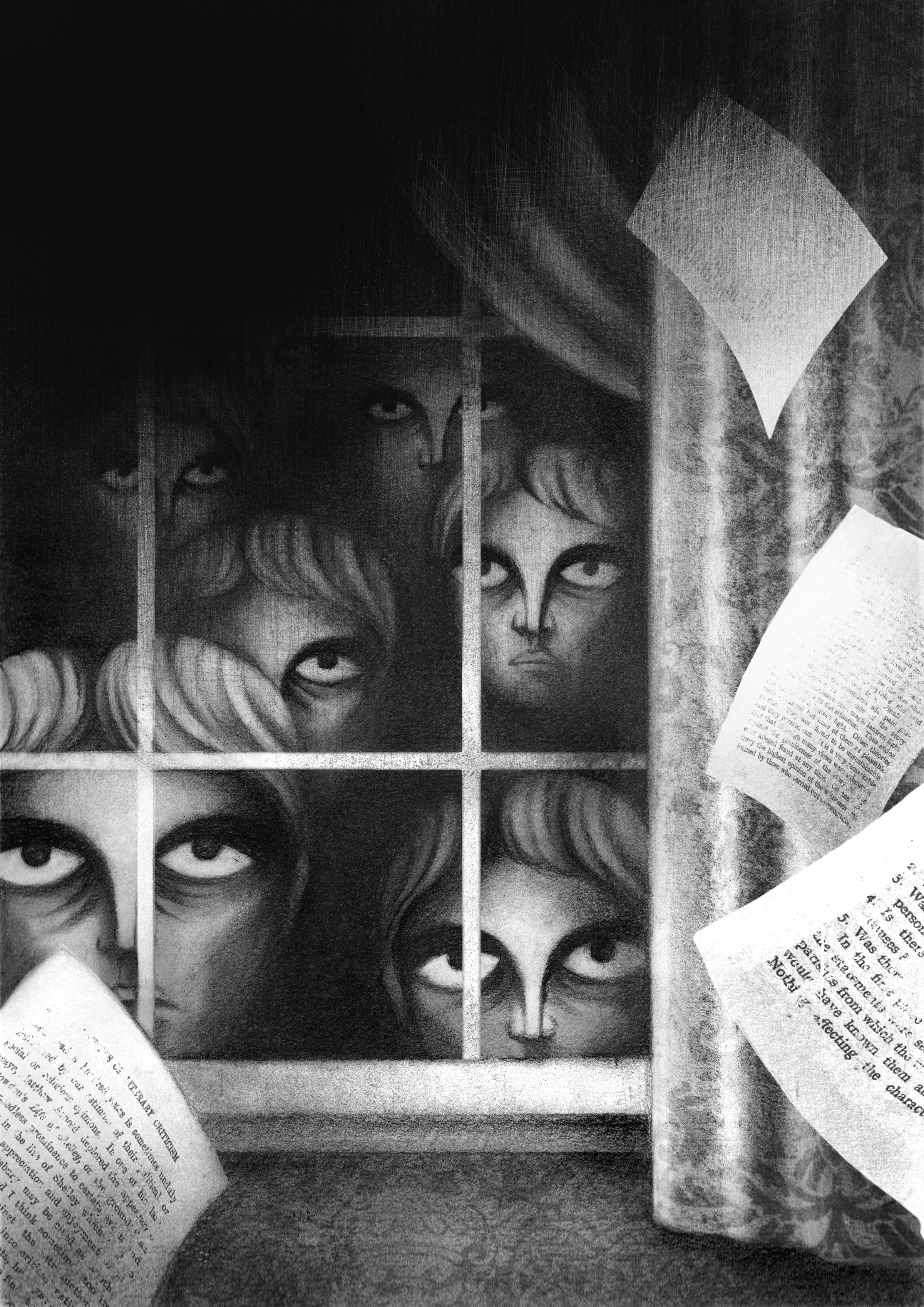
The drawings and structures presented at Random Turns originated from sketches, drafts and studio experiments created over the past few years. Some of Vladmir’s works are further explorations of the ideas that took root in his book illustration projects; other times, the compositions were inspired by random occurrences that happened throughout the day. Many of the artworks were created with much consideration for the environment in and around Turn Park Art Space.

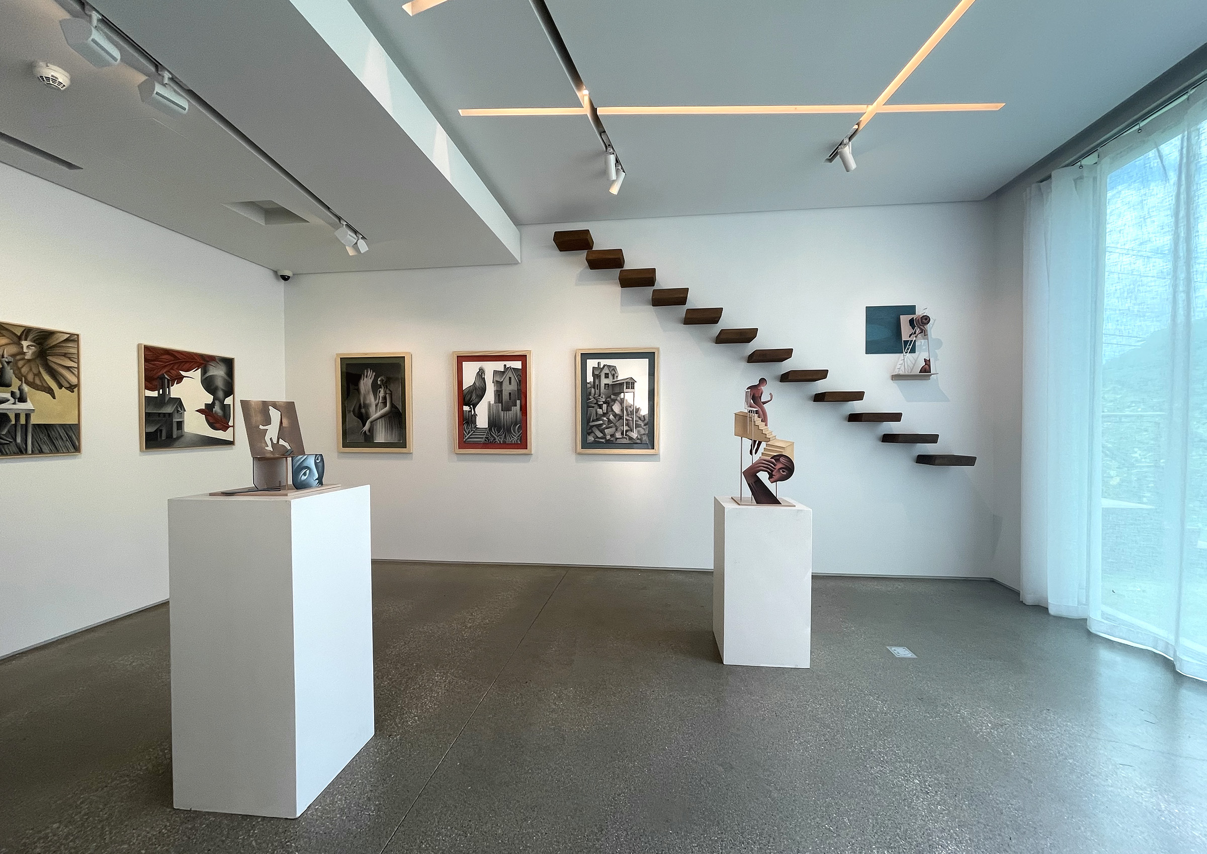
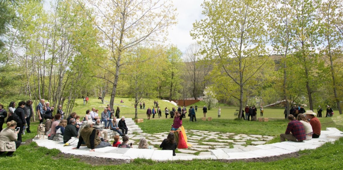
TurnPark is a contemporary art space, situated on 16-acres of a former quarry in the Berkshires. There are hills, meadows, a lake, and a 65-foot vertical drop offering breath-taking views of the surrounding landscape. It is home to a unique collection of outdoor sculptures, as well as ongoing art exhibitions and temporary installations. Located just 40 minutes away from MASS MoCA and other cultural landmarks.

If you are in the area, I hope that you can stop by and check out this truly unique and beautiful space. More information about the exhibition and the park can be found here.

In other developments, I am getting ready to embark on a new book illustration project that will keep me busy through the fall and plan to participate in the Oxford Book Fair in England in December, where Haddocks’ Eyes will make its European debut.

Codex 2017

Here is to another amazing CODEX 2017: International Artists’ Book Fair experience! It was great to see old friends and make new ones, share and see recent work, get new book ideas and collaborations flowing and celebrate the art of the book in all of it’s glory. Many thanks to Peter Rutledge Koch, Susan K. Filter, all the organizers, exhibitors and book admirers for making this happen! Here are a few snapshots that I managed to get while running around and trying to absorb everything. All the rain and me losing my voice for almost two days only added to the experience. Back on the east coast now, shoveling snow and looking forward to 2019!!

Blackstar

On January 10 we got the news… We were in LA then and on KCRW they played Bowie songs all night long. Each one I revisited represented a certain era, a certain feeling in time and a unique artistic achievement. One of the true artists to walk this earth was gone. A couple of days later, I listened to the Blackstar album on a continuous loop and drew.

Bowie


Illustrations for Alexandr Chayanov’s Stories, part 1

Some time ago, my mentor Mihail Chemiakin presented me with a book – a collection of short stories by Alexandr Chayanov. Chemiakin suggested that I should have a go at illustrating some of the writing.

Mirror FINAL print

As I started reading, the stories blew me away by their dark and whimsical narratives, the nature of the characters, the picturesque descriptions of early 20th century Moscow, its surroundings… A man falls in love with a doll depicting two conjoined twins and sets on a journey through Europe to find them, another man buys a mirror in an old Venetian shop and becomes a prisoner of his own reflection. Some of the other characters include ghosts, mermaids, circus performers and mannequins. The narratives are filled with mysticism and grotesque.

Doodling FINAL print

The stories were first published in the 1920’s in Russia and became quite a sensation. In her memoir, Mikhail Bulgakov’s wife, Elena Belazerskaya mentions that Chayanov’s stories had a huge influence on Bulgakhov and eventually influenced his masterpiece “Master and Margarita”.

faces FINAL2 print

However Chayanov never became a household name. His books were never translated into any other language. Chayanov’s fate is as mysterious as his stories. His main profession was an agrarian economist, he was a scholar of rural sociology and an advocate of agrarianism and cooperatives. In 1930 he was arrested by the Soviet officials and his books became banned. In 1937 he was arrested again, tried and shot to death on the same day. His writing did not resurface until the late 80’s, and even then they were published abroad.

Old man FINAL2 print

Creating visuals for those superb stories created a true challenge. I knew that I didn’t want to use the linocut technique that I’ve used illustrating Meyrink, Gogol and Poe. There was a softer tone; dark, melancholic and at the same time whimsical and sometimes even humorous. There were some hints of Art Nouveau, something from the Impessionists with a bit of Goya and Jacques Callot.

Dancing FINAL print

Leaving the carving tools behind and getting out of my comfort zone, I’ve started doing charcoal drawings, constantly looking at a lot of turn of the 20th century photography. The atmosphere in those photos helped me understand Chayanov’s environment.

floating new FINAL print

At this point I’ve done 6 illustrations that were drawn, collaged and then digitally manipulated. Still a work in progress with many more to come. Stay tuned!

The Call of Cthulhu in 3D

HP Lovecraft cover

Back in 2010 I was approached by Matthew Broughton, a senior designer at Vintage, to do a cover for The Call of Cthulhu by the great H.P. Lovecraft. This was going to be one in a series of 5 classics that they were releasing that year that would feature a 3D cover. This was the really cool part! Each book would come with a pair of 3D glasses and obviously the cover needed to be dimensional. I was quite intrigued by this challenge and got down to work.

Zimakov Cthulhu sketch

After brainstorming, a few pencil sketches and ink drafts, I moved forward with the lino. In addition to the image, we decided that the title should also be carved out.

HP Lovecraft Cthulhu

linocut title Call of Cthulhu

I usually print proofs and drafts on my little etching press in the studio, the final printing in this case was done at the Otis Lab Press on one of their Vandercooks.

Vandercook Zimakov

Once everything was printed, scanned and digitized, I skewed the type a bit to give it more of a dramatic look and make it fit with the image more. At this point the trick was to get the image working with the 3D glasses (final version on the right).

Call of Cthulhu printmaking linocut

After some internet research and looking through tutorials I reached out to my good friend Jim Campbell for some tips with this. Jim’s an expert. He collects antique photographs and gives them a 3D effect (some of this stuff can be seen here). Jim was quick to respond with some pointers.

3D tutorial

Then it was on to more Photoshop for me. I first broke down the image and title into many layers, depending on how close or far I wanted them to appear. Bellow are the two main separations, but there are quite a few little sub layers within them. Those were placed on top of one another using the Multiply blending mode (third image).

3D separation linocut

From that point on it was a matter of sitting in front of the screen for a few hours with the 3D glasses on and shifting layers left and right, up and down. Don’t want to get too technical here. The main trick is this: the more the red and cyan layers are off-register, the closer that part will appear to the viewer, the more they are in line with each other – the farther the image will be.

Cthulhu Zimakov

If you get your 3D glasses out you can see the effect, however your monitor colors might be off. So the best thing to do is get the book and see it in person. The 3D glasses come with it!

The Sound of a Migrane

In the summer of 2011 I have met Mihail Pogarsky, a man who is hugely involved in the Russian Artist Book art scene. He organizes annual Artist Book Fairs in Moscow, publishes a magazine on the subject, initiates a variety of international book projects and creates beautiful books himself. Over coffee we’ve discussed many aspects of what we do and what’s happening in the book art world in Russia and USA. Several months later I have received an email from him asking me if I would be interested in participating in a project that he is curating entitled Music of the Book. 12 artists from Russia and 12 from Germany and Austria were involved. This was designed to be a multidisciplinary project between Artist’s Book and multimedia. The books that were to be created would be part of an international traveling exhibition. Bellow is my entry.

Sound of Migrane book

The brief was to create a one or two spread book that will reflect visually a certain piece of music, sound, noise, etc. I initially wanted to take a piece of music for the interpretation (Gavin Bryar’s Jesus Blood Never Failed Me Yet, for an example). Then an idea came to use a sound that is not a sound at all. To visualize something that we all hear sometimes inside of us, but that can not be projected or recorded. So here are the process stages of The Sound of a Migraine:

I wanted to use the image of the rats scraping away at something. I “borrowed” the rat linocut image from a piece that I have done last year for a story by Adgar Allan Poe. The choosing of the background followed.

This was going to be a collage. I wanted to actually cut out the “pounding headache noise”.

Zimakov collage

After a while, the studio desk was filled with x-acto knives, ink, prints, chipboard and paper.

Zimakov studio

In addition to the cut-out red “sounds”, I made a rubber stamp that would be stamped in black over the final inside spread.

stamp

The cover image would serve as an introduction to what’s inside. Prints and cutouts were mounted onto a chipboard.

book cover

This book was an edition of two. Both copies were sent to Mihail in Russia. So far they have been exhibited at the Central House for the Artist in Moscow and the Tretyakov State Gallery, among other places. Germany is next,  so you might catch them floating around Europe at some point! Check out more about the concept and see other artists’ submissions here.