After the draft is complete (see Sketch to Lino Process, part 1). The design needs to be printed out on a laser printer. You will also need CitrSolve solution, a foam brush, bone folder, masking tape, lino block and some paper towels. This is the method I use to transfer the image onto a linoplate:
Tag Archives: sketch to lino
Sketch to Lino Process, part 1
Working out all the details of the composition at the draft stage is quite crucial before moving on to carving the lino. In this part, I will walk you through my approach and in the second part show how I transfer the refined draft on to a lino block.
Some artists prefer more of an expressive approach and can start carving based on a very rough sketch. Some prefer to draw directly on a lino block. I found that resolving all the details of the composition beforehand on paper is quite helpful and will illuminate any miss steps down the road. I prefer to develop the draft in pencil or on a tablet so that it looks very close to the final linocut. There will still be quite a lot of things to improvise on once you start carving, since carving is very different from drawing.
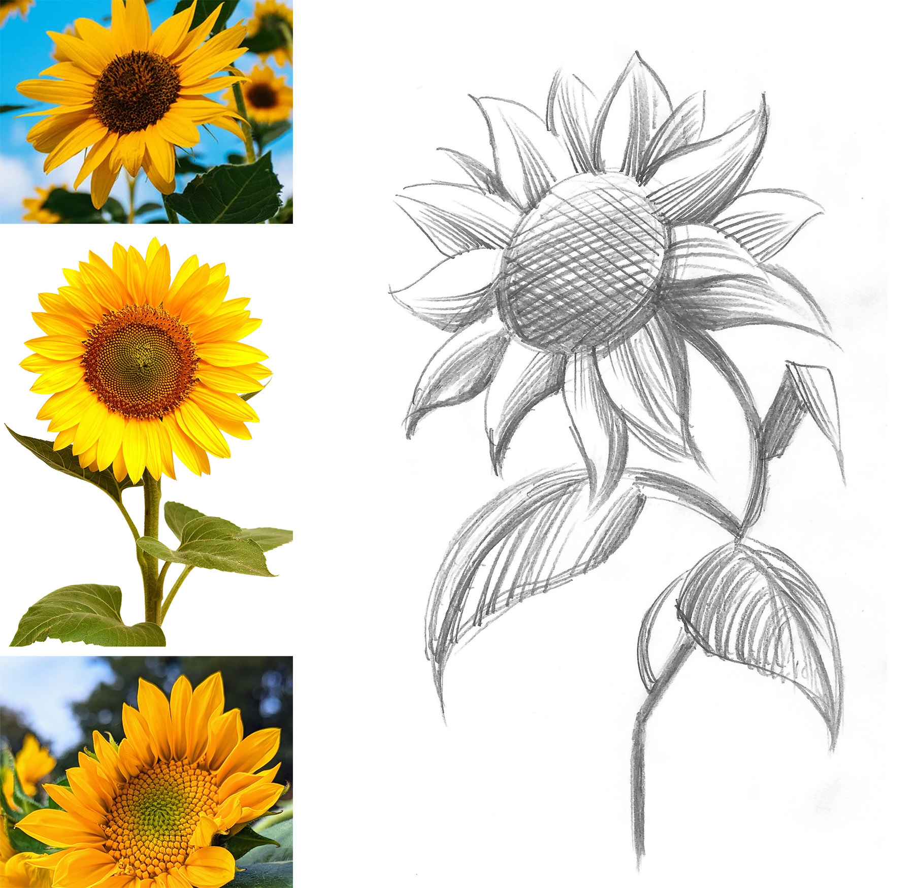
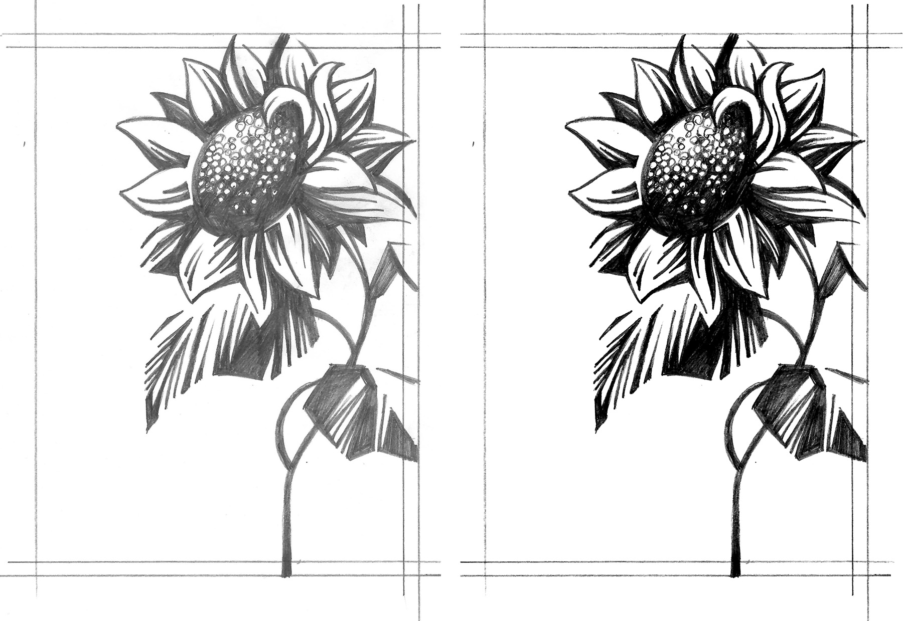
Here is an example of a flower sketch that I’d like to turn into a linocut, including some initial reference photos.
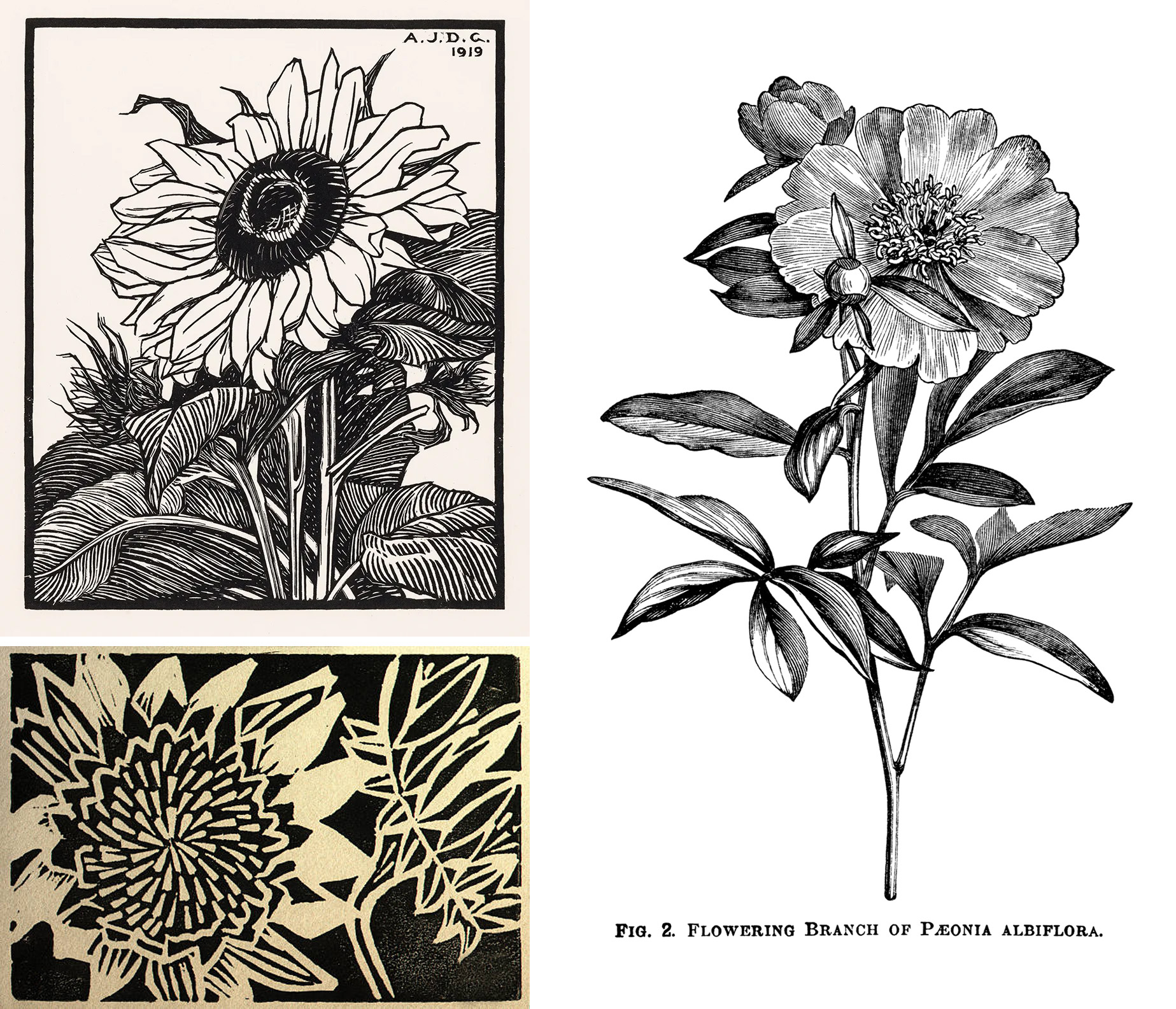
This is just an idea and it doesn’t really give me much clues on how to approach the shading or the cross hatched parts, along with other elements of design. Remember that you can’t really create “greys” in a one color linocut, but you can create an illusion of greys and halftones. Relief printmaking has its own visual vocabulary which is different from drawing or painting. At this point it’s very helpful to do your research and get clues from how other printmakers were able to achieve the results that you are going for. When studying the reference images, it’s important not just to copy the technique, but see what additions you can make to create a more unique, personal look.
Here are just a few examples of classical plant prints (top left – a print by Julie deGraag, 1919; bottom left and right – artist unknown).
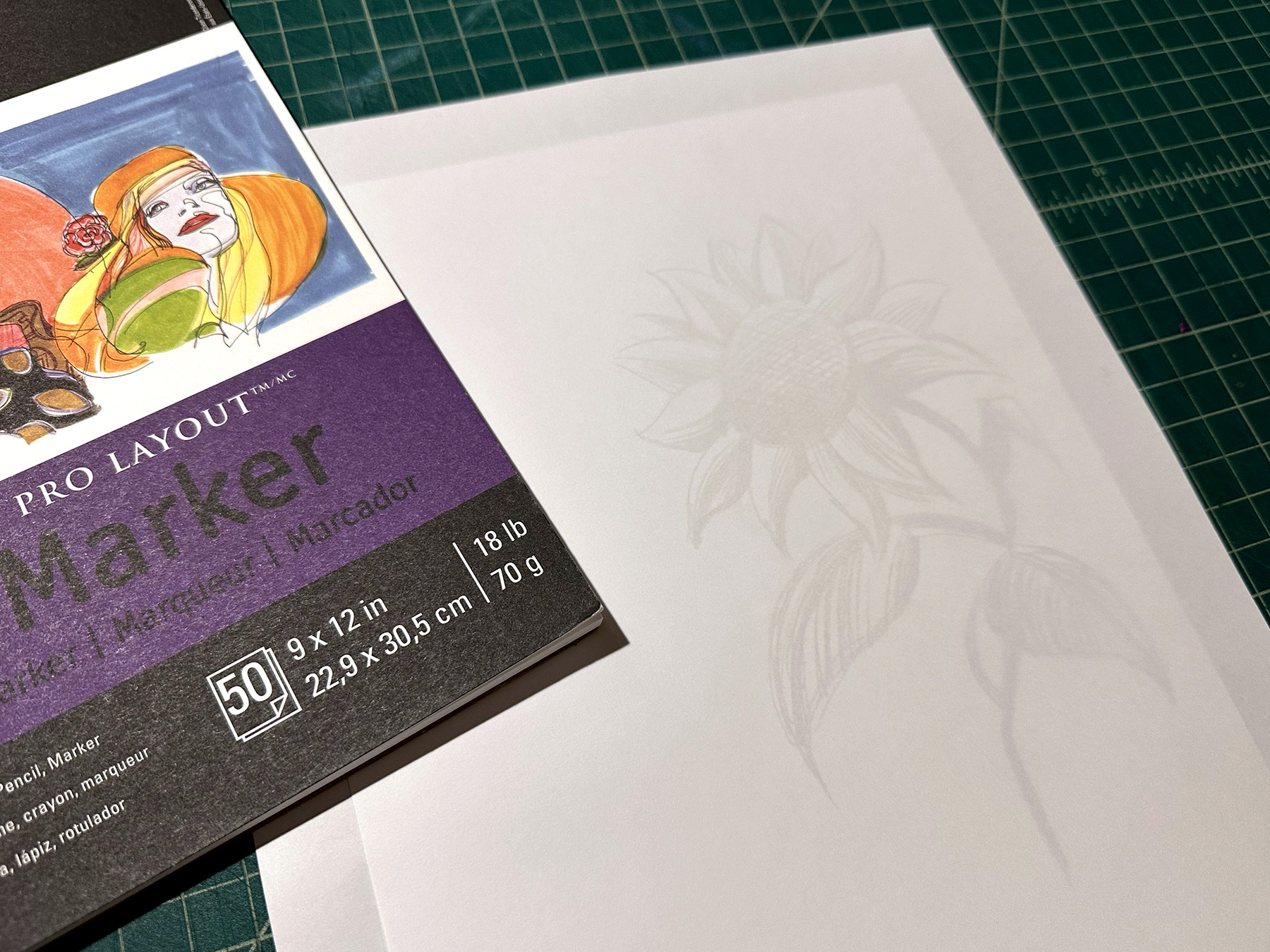
I lay the sketch under the marker paper and start to work out the details. You can see through the marker paper, so that’s really helpful, but it’s not as transparent as tracing paper. So, you can work on a new interpretation while still seeing the original sketch. You can also use regular print paper and a lightbox for this step.
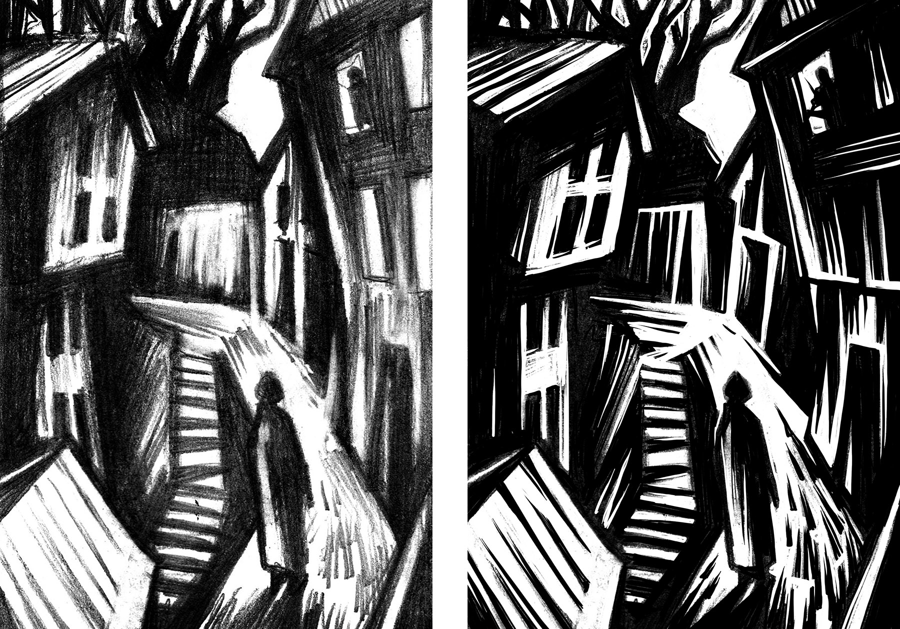
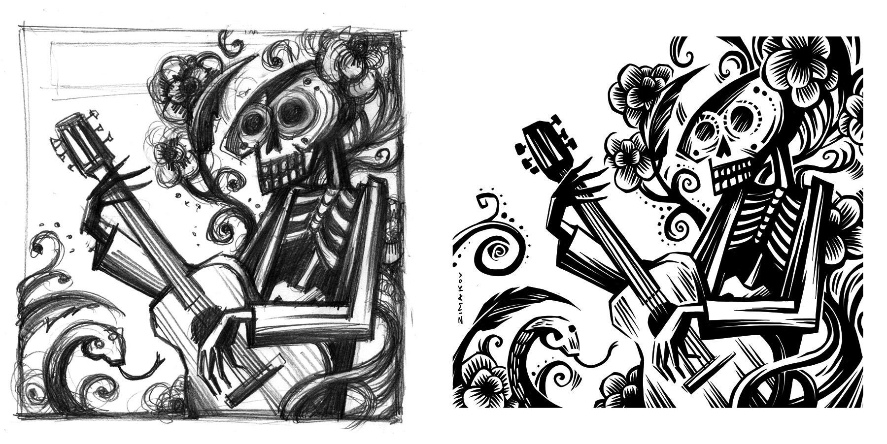
Sometimes I rework the draft several times until everything is how I would like it to be. At this stage I am trying to eliminate the grey tones and just focus on solid black lines and shapes. After the final draft is complete (left image), I scan it and increase the contrast in Photoshop (right image). When the image will be transferred onto a lino block from a printout using CitraSolve solution, it’s important to eliminate all the greys, since they will not transfer – more on this in the next part.
Once I have a solid black and white image, I am ready to transfer it to a plate.
When working on the multi-color print, I still like to start with the solid framework (one plate). Once that’s resolved, I will start to add additional layers that I want to be in color. This can be done on a marker paper or directly in Photoshop. Lately, I have been going over the final pencil drafts on a drawing monitor or iPad pro. It’s easy to create layers and try out different approaches. Below is an example of a sketch and refined draft created in Photoshop using an XP-Pen drawing tablet.
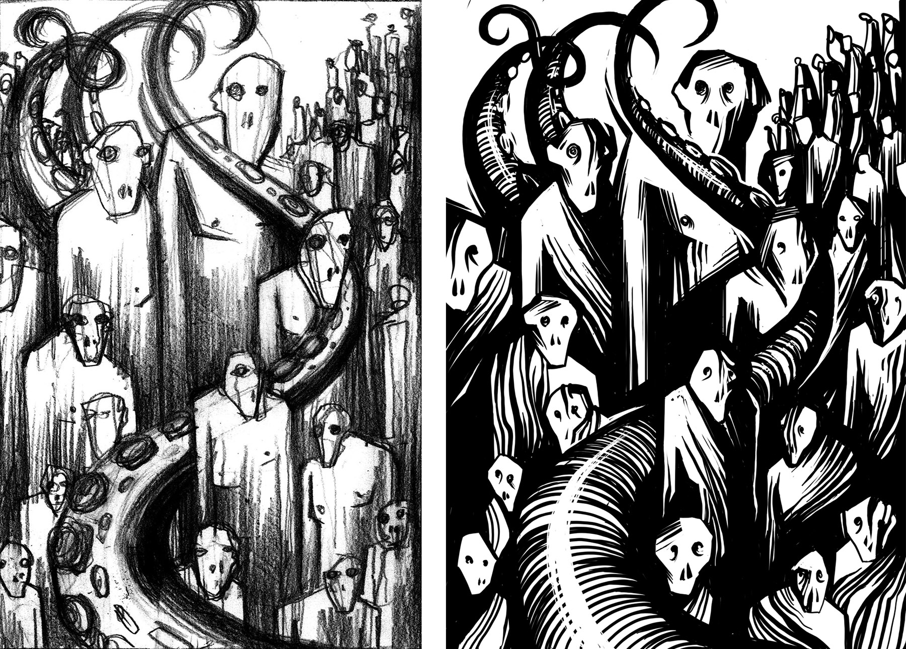
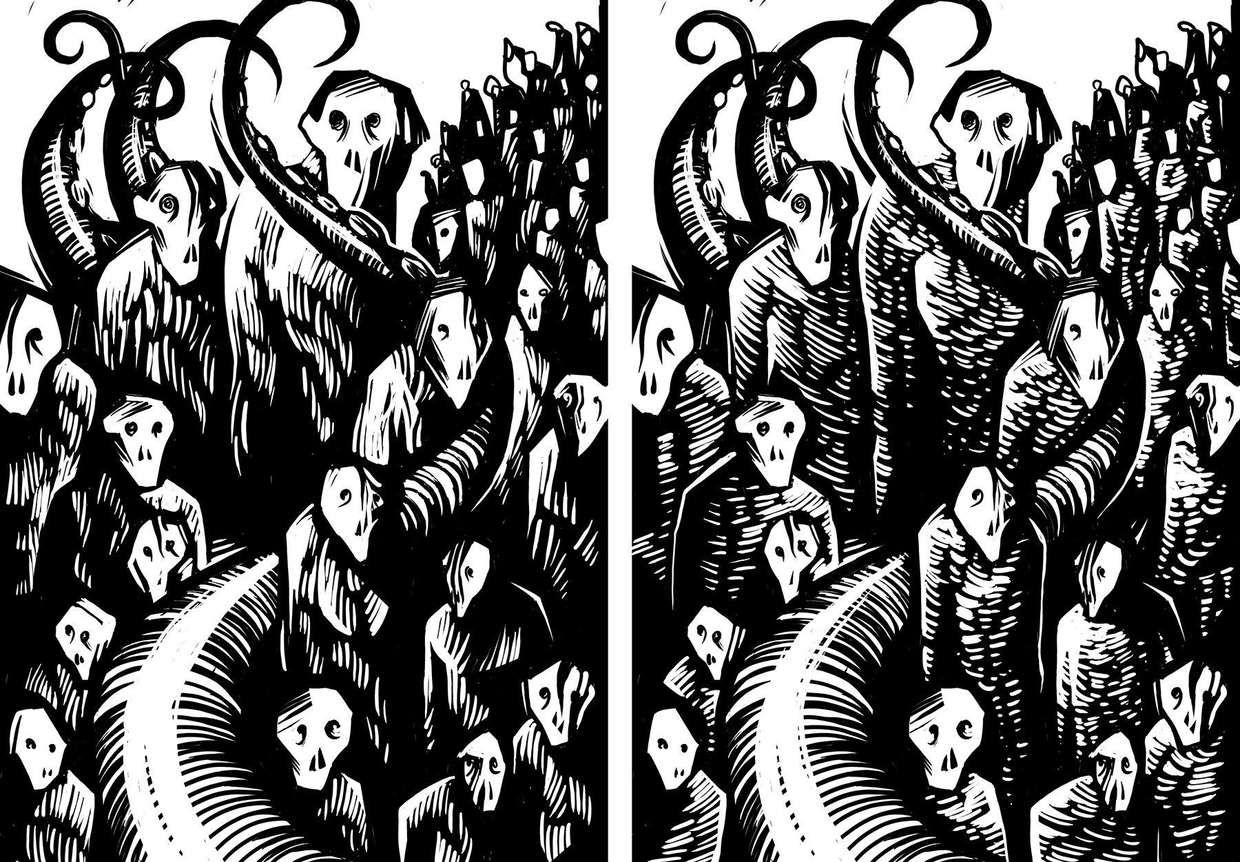
It’s important not to rush things. I usually let the printout of the draft hang in my studio for a few days. Oftentimes, I would make adjustments or add additional elements, while thinking about the final print and the limitations that I might encounter when carving. In the examples below I kept the composition the same, but tried out different textures on the characters to see what will give me the most dynamic composition. The version on the left was used for the final print.
Here are a few more examples of initial sketches and the final draft ready for transferring to a linoplate.
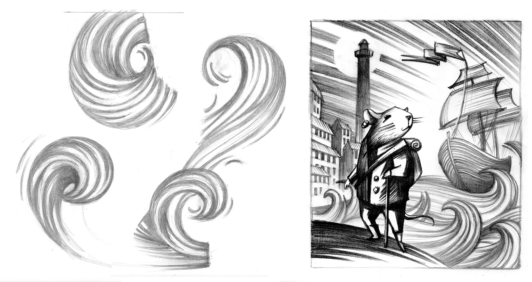
TIP: When working out an element that you haven’t done before in a print, it’s always good to practice various approaches to creating that element. Those are different interpretations of waves and how I applied them in a final composition.